Manhattan Maid Logo Design
Handled: Logo Design, Corporate & Services
Client Name: Manhattan
Industry: Manpower Consultant
City: Singapore
Country: Singapore
Other designs handled for Manhattan
Crafting the Logo for Manhattan Maid by our logo designing team : A Blend of Culture, Quality, and Care
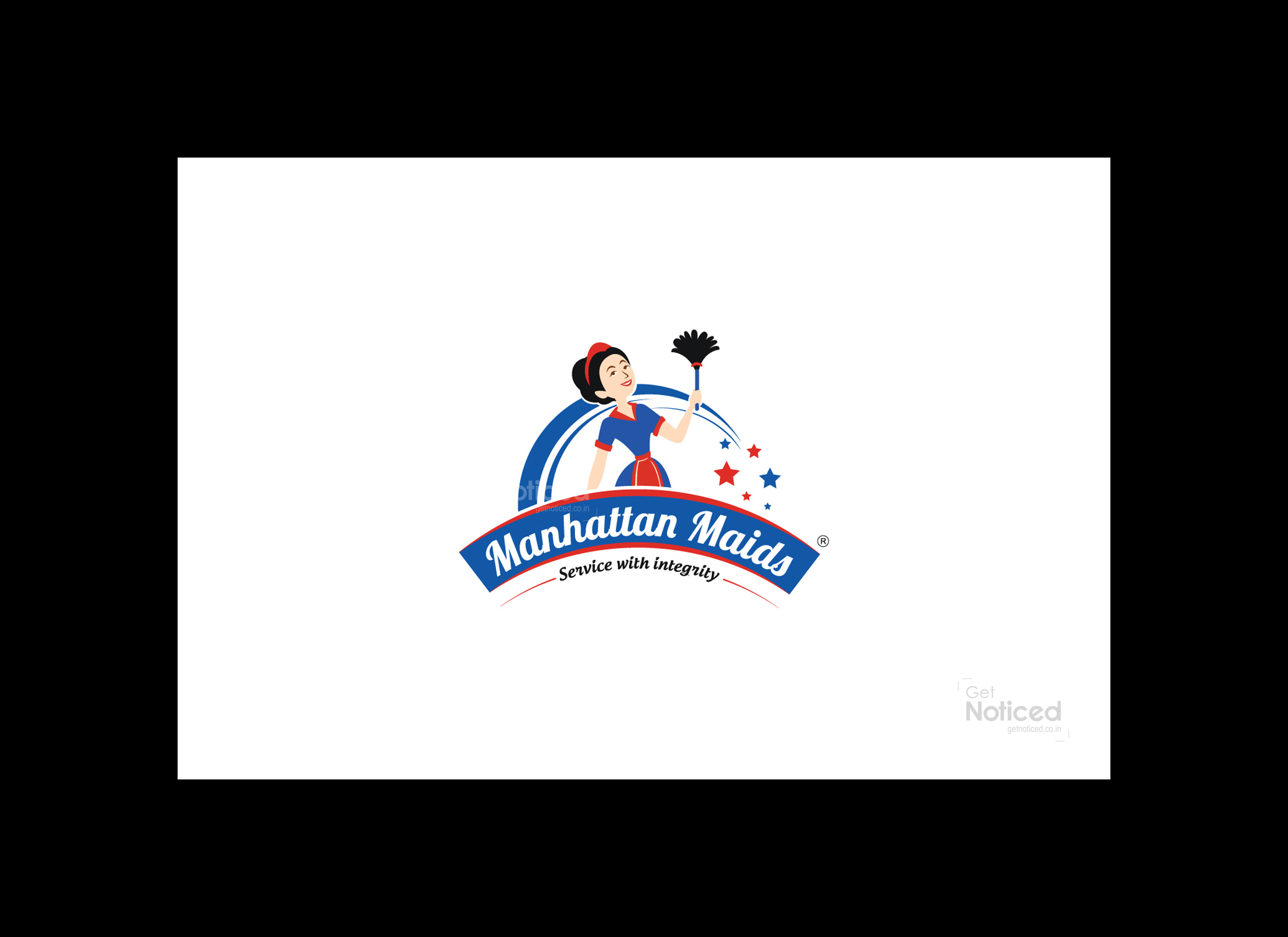
Introduction: A logo serves as the visual representation of a brand, encapsulating its essence and values. When tasked with designing a logo for the band name Manhattan Maid, our creative design team delved into the cultural significance of Manhattan, as well as the company's commitment to providing high-quality and skilled maids who cater to diverse language needs. After extensive research and collaboration, we proudly present the final logo, which incorporates a mascot character representing the maid's caring nature, accompanied by three different characters, all showcased in a captivating calligraphic font style.
Exploring Manhattan's Significance: Manhattan, often referred to as the economic and cultural center of the United States, is home to iconic landmarks such as the United Nations Headquarters. It represents a melting pot of cultures, diversity, and a vibrant atmosphere. Recognizing this, our design team sought to infuse the logo with elements that embody these qualities, while staying true to Manhattan Maid's core services.
Quality Service and Language Proficiency: Manhattan Maid distinguishes itself by providing top-notch maids who possess exceptional skills and are certified in caring for individuals from infants to the elderly. Moreover, their ability to communicate in various languages adds a valuable touch to their service. Understanding the importance of these factors, our team aimed to visually communicate the brand's dedication to quality and multilingual expertise through the logo design.
Mascot Logo Design: Upon discussions with the client, it became apparent that a mascot logo would effectively represent Manhattan Maid's caring and reliable nature. The mascot character, carefully crafted by our designers, showcases a friendly and trustworthy maid figure. With a warm smile and nurturing posture, the mascot symbolizes the company's commitment to providing exceptional care and support to its clients.
Incorporating Cultural Elements: To honour the cultural diversity of Manhattan, our design team incorporated three distinct characters into the logo. Each character represents a different culture, reflecting the cosmopolitan nature of the city. By doing so, we not only pay homage to the cultural fabric of Manhattan but also emphasize the company's ability to cater to clients from various backgrounds, ensuring effective communication and a personalized approach to their needs.
The Final Logo: After multiple iterations and fine-tuning, the client approved the final logo design. The logo prominently features the mascot character, exuding warmth and professionalism. The calligraphic font style adds a touch of elegance, capturing the sophisticated essence of Manhattan Maid's services. The combination of the mascot and the multicultural characters conveys a sense of inclusivity, making it evident that the company embraces diversity and understands the unique requirements of its clients.
Conclusion: Crafting the logo for Manhattan Maid was a process fueled by research, creativity, and an understanding of the brand's core values. By incorporating elements of Manhattan's cultural significance, emphasizing quality service, and integrating a mascot character and multicultural figures, our design team successfully created a logo that captures the essence of Manhattan Maid's commitment to providing exceptional care to clients from diverse backgrounds. The final logo stands as a visual representation of the brand, symbolizing reliability, cultural diversity, and the company's dedication to excellence.


