Nutz N Bites Logo Design
Handled: Logo Design, Food & Beverages
Client Name: Nutz N Bites
Industry: Nuts & Dry Fruits
City: Chennai
Country: India
Other designs handled for Nutz N Bites
NUTZ N BITES: The Art of Crafting a Memorable Logo by get noticed team
Introduction: When the popular Indian snack shop, NUTZ N BITES, based in Chennai, approached our creative design team, they had one objective in mind: to create a captivating logo that would entice more customers to their shop. By carefully listening to the client's requirements and brainstorming innovative ideas, our team successfully crafted a logo that captured the essence of their brand. This article will provide an insight into our creative process and how we ultimately designed a logo that not only met the client's expectations but also visually represented the nature of their business.
Client Requirements and Initial Concept: The client had a clear vision of what they wanted their logo to portray. They expressed their desire for a silhouette-style design that would resonate with their target audience. Understanding their objective, we began working on four initial logo concepts, each embodying the essence of NUTZ N BITES.
Integrating the Nature of Business: Given that the client's business revolved around Indian snacks, it was crucial to incorporate elements that represented their offerings. After brainstorming ideas, we decided to focus on the concept of nuts, which are a primary ingredient in their products. Nuts have a natural connection to the business and provide an instant visual association for potential customers.
Conveying the "Bites" Element: To address the challenge of expressing the word "bites" in the logo, our team engaged in extensive discussions and creative exploration. We aimed to capture the delightful experience of indulging in a favorite snack. It was during these discussions that a captivating idea emerged - the fascination and satisfaction that arise from biting into a beloved nut or snack.
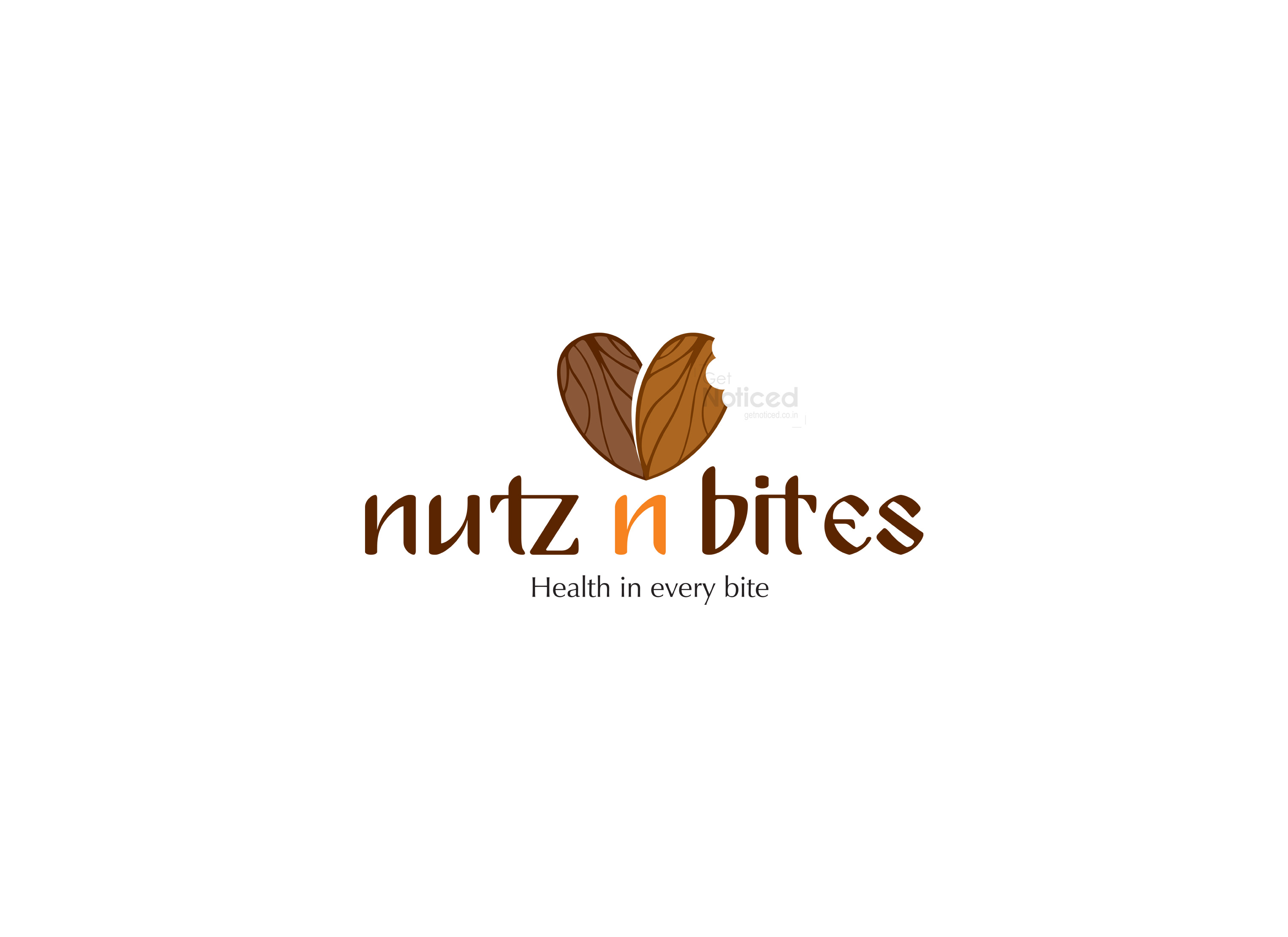
The Creation of the Logo: Building upon this insight, we decided to incorporate a bitten nut into the logo design. Placed on the opposite side of the intact nut, it formed a heart shape. This addition not only conveyed the concept of "bites" but also emphasized the health benefits associated with nuts. The heart shape subtly communicated the brand's commitment to providing wholesome and nutritious snacks to their customers.
Client Approval and Final Design: Upon presenting the four sample logos to the client, the chosen design immediately caught their attention. They were captivated by the simplicity, creativity, and symbolic representation of their brand. The logo effectively captured the attention of potential customers while maintaining a strong connection to their products.
Conclusion: Crafting a logo that stands out and effectively represents a brand's identity is a meticulous process. In the case of NUTZ N BITES, our creative design team embraced the challenge and skillfully developed a logo that ticked all the boxes. By incorporating the silhouette style requested by the client, infusing the logo with nuts to reflect the nature of their business, and cleverly incorporating the concept of "bites" through a bitten nut forming a heart shape, we achieved a memorable and meaningful logo design. NUTZ N BITES now possesses a powerful visual identity that will undoubtedly attract more customers and contribute to the success of their snack shop in Chennai.


