Kmk International Logo Design
Handled: Logo Design, Nature & Organic
Client Name: Kmk International
Industry: Spices Oil Extraction
City: Colombo
Country: Sri Lanka
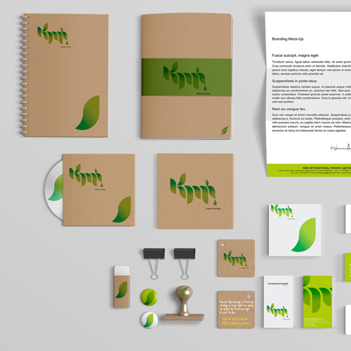
Other designs handled for Kmk International
Crafting a Professional Identity by get noticed team : The Logo Design for KMK International
Introduction: In the competitive world of business, a well-designed logo plays a vital role in establishing a unique identity for a company. KMK International Pvt Ltd, a renowned manufacturer of essential products with global demand, recognized the importance of a visually appealing and distinctive logo. They approached our creative designing team to create a logo that would represent their business in a professional and memorable manner. Through an interactive session with the client, our team diligently worked to understand their requirements and translate them into an exceptional logo design.
Exploring Options: To ensure that the final logo would reflect the essence of KMK International, our team embarked on a comprehensive research journey. We studied various logos in the manufacturing and oil production sectors to gain insights into effective design strategies. Armed with this knowledge, we set out to design a logo that would capture the professionalism and global presence of KMK International.
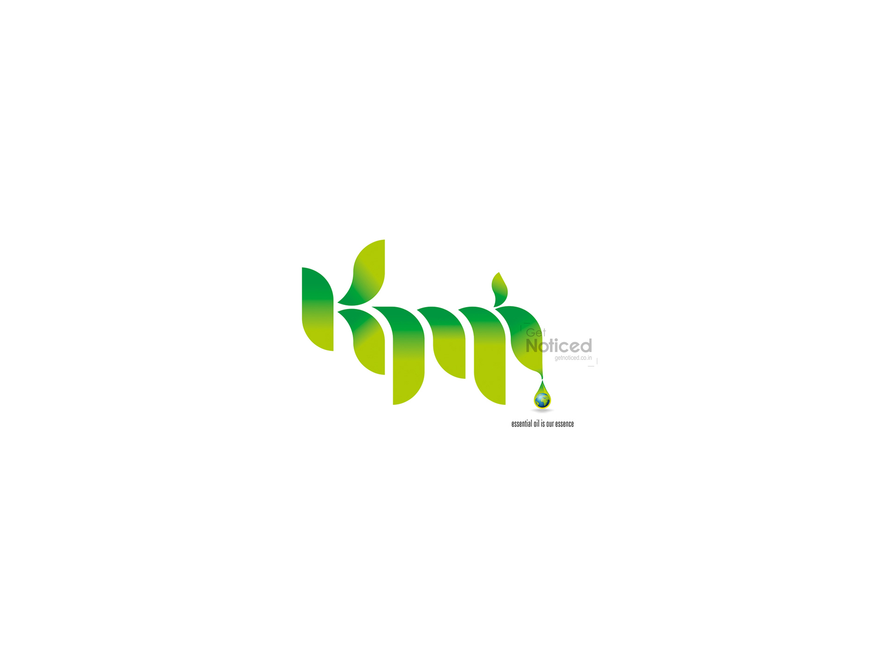
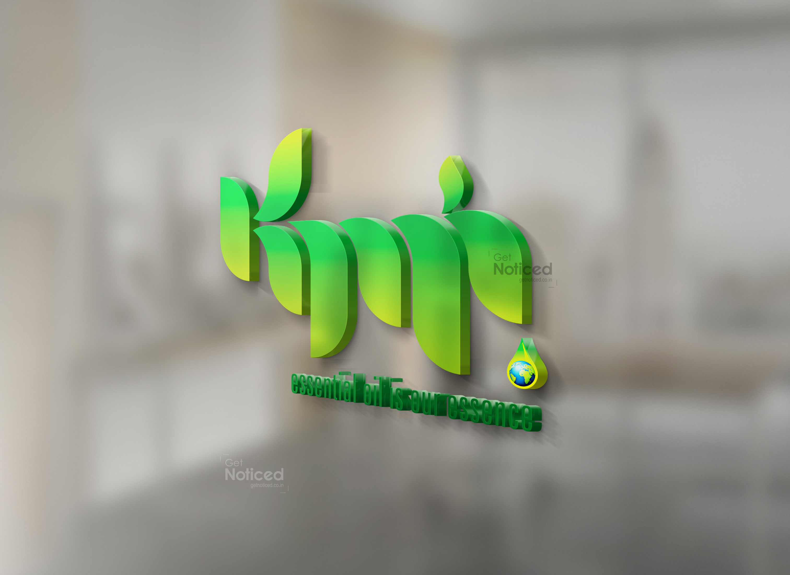
Symbolizing Oil Production: One of the key aspects the client wished to emphasize was their expertise in oil manufacturing. With this in mind, we focused on incorporating elements that would signify this industry. The letters "KMK" were designed to resemble oil pipelines, symbolizing the company's role in the oil production sector. This choice aimed to create an immediate visual association between the logo and KMK International's core business.
Depicting Global Demand: Given KMK International's global reach, it was crucial to incorporate a visual element that represented their wide market presence. To achieve this, we added an oil drop at the end of the lettering. This drop served as a subtle reminder of the company's oil-related products. However, the drop was not just an ordinary oil droplet; it held a hidden meaning. Inside the drop, we incorporated a globe, representing the company's global demand and reach. This fusion of the oil droplet and the globe effectively conveyed KMK International's international influence and widespread popularity.
The Final Result: After presenting the client with four sample logos that encapsulated their requirements, we eagerly awaited their feedback. Their selection process culminated in the final logo that we proudly present today. The chosen design beautifully combines the professionalism of the oil industry with the global appeal of KMK International. The clean and sleek lines of the letters "KMK" mimic oil pipelines, while the oil droplet with the embedded globe conveys the company's international presence. The logo effectively communicates the company's core values and aspirations.
Conclusion: The logo designed for KMK International by our creative team is a testament to our dedication to understanding our clients' needs and translating them into visually striking designs. By incorporating elements that represent the oil manufacturing sector and the company's global demand, we successfully created a logo that is both professional and memorable. This logo will undoubtedly serve as a powerful tool for KMK International to establish its unique identity in the market and leave a lasting impression on its customers worldwide.


