Rb Builders Logo Design
Handled: Logo Design, Real Estate
Client Name: R.b. Builders
Industry: Builders
City: Chennai
Country: India
Other designs handled for R.b. Builders
RB Builders Logo by our creative team : A Symbol of Quality Residential Construction
Introduction: RB Builders, a renowned name in the field of quality residential flat construction, has recently unveiled their new logo. Created by the talented design team at Get Noticed, the logo captures the essence of RB Builders' expertise and commitment to excellence. By incorporating the initials "RB" in a building form and complementing it with a touch of greenery, the logo effectively communicates the brand's dedication to environmentally friendly projects. Let's delve deeper into the design process and the significance of each element.
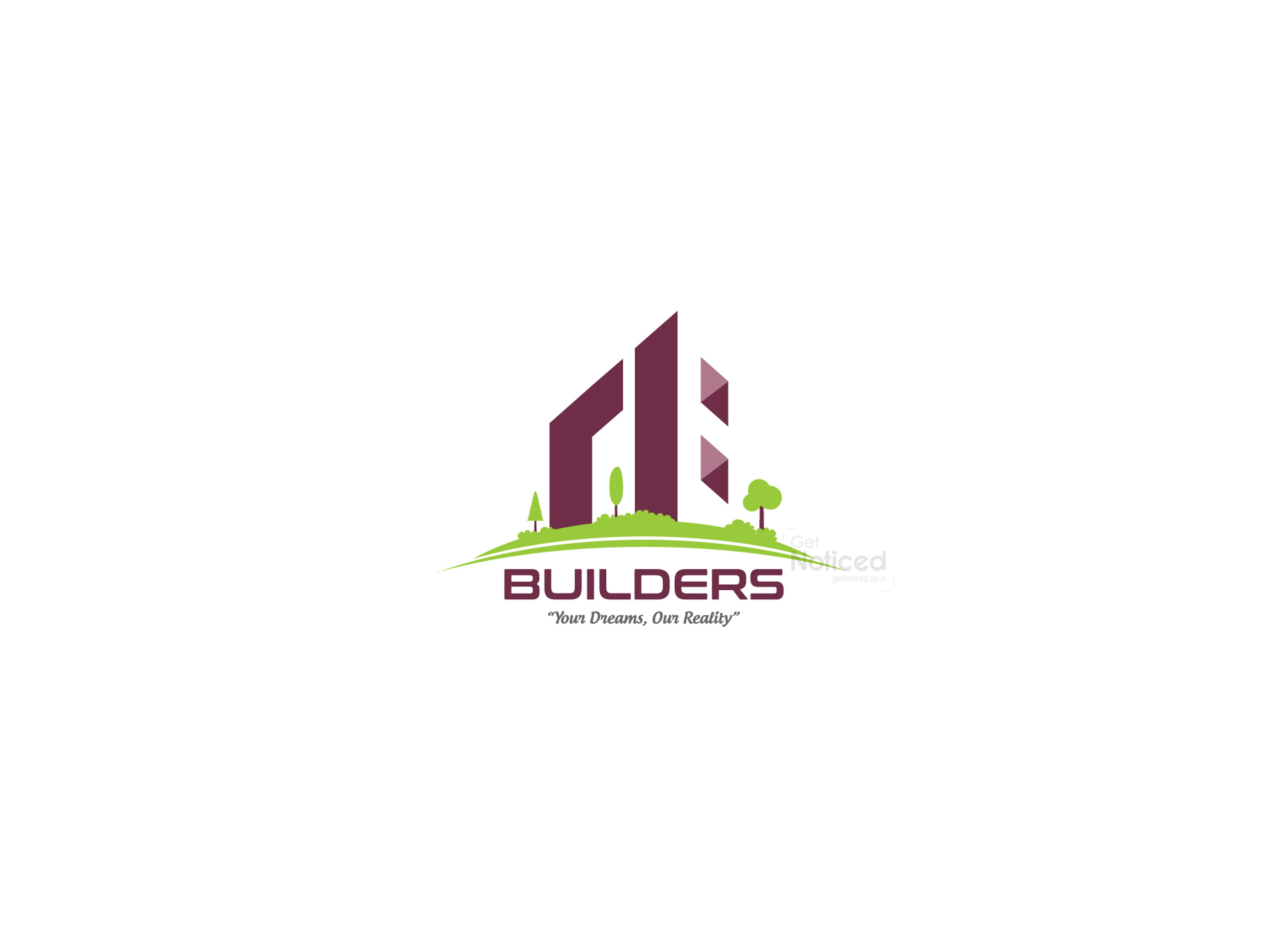
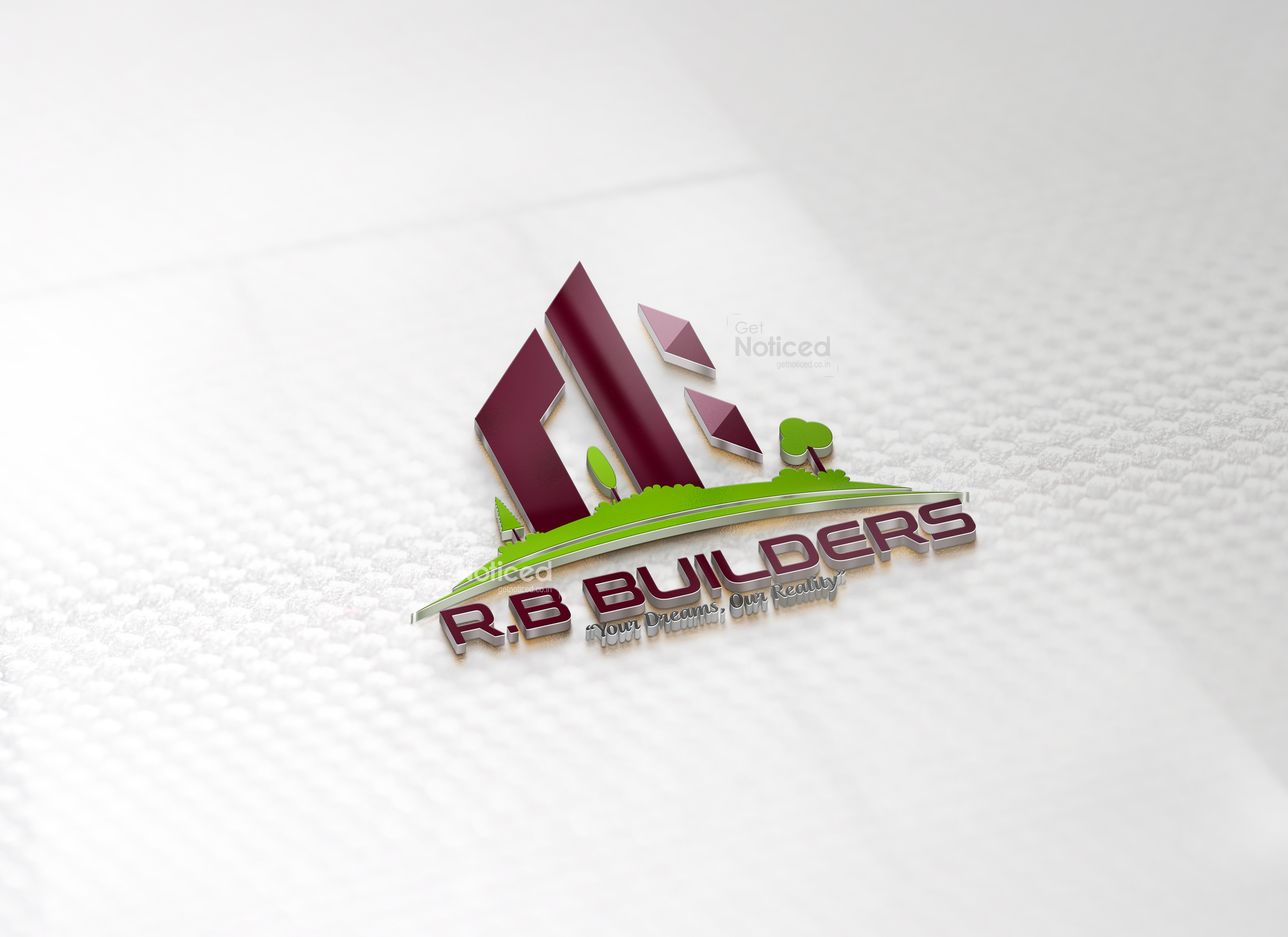
The RB Building Concept: When tasked with designing a logo that emphasized the brand's identity as residential builders, the Get Noticed team explored various creative avenues. After brainstorming and manual sketching, they arrived at a unique concept: using the initials "RB" to form a building shape. This approach successfully encapsulated the essence of RB Builders' core services.
The Selected Logo: Among the several options presented to RB Builders, the client was captivated by the first logo presented, as it instantaneously resonated with their vision. This chosen design combines a clear and simple font for the word "Builders" and cleverly integrates the letters "RB" into the form of a building. This visual representation immediately establishes the brand's identity as residential builders.
Emphasizing Nature-Friendly Projects: One prominent element in the RB Builders logo is the touch of greenery at the bottom. This addition serves as a powerful symbol, representing the brand's commitment to eco-friendly construction practices. By showcasing this element, RB Builders communicates its dedication to creating sustainable living spaces that harmonize with the environment.
The Use of Color and Typography: The chosen logo employs a thoughtful color scheme and typography that enhance its overall impact. The letters "RB" in the building structure are depicted in a solid, bold font, signifying strength and reliability. Simultaneously, the word "Builders" is presented in a clear, simple font, ensuring legibility and readability.
Conclusion: RB Builders' new logo, crafted by the talented team at Get Noticed, encapsulates the brand's identity as quality residential flat builders. By cleverly integrating the initials "RB" into the form of a building, the logo immediately conveys RB Builders' expertise in construction. The touch of greenery reinforces the brand's commitment to environmentally friendly projects. With its strong design, meaningful symbolism, and professional typography, the RB Builders logo is sure to make a lasting impression in the minds of clients and stakeholders alike.
As RB Builders continues to provide exceptional residential constructions and sustainable solutions, their logo will serve as a powerful emblem, representing their dedication to quality, reliability, and environmental consciousness.


