Push Up Logo Design Push Up Logo Design

Push Up Logo Design

Handled: Logo Design, Sports & Fitness

Client Name: Push Up

Industry: Fitness Studio

City: Chennai

Country: India

Other designs handled for Push Up

Crafting an Impressive Logo for PUSH UP by get noticed logo designing team : A Fitness Center in Chennai

Introduction: Logo design plays a crucial role in creating a brand identity for any business. When PUSH UP, a renowned health and fitness center based in Chennai, India, approached our creative design team, we knew that crafting a logo that effectively represented their values and aspirations was of utmost importance. Through collaborative discussions and a deep understanding of the client's expectations, our team successfully designed a logo that captured the essence of fitness and professionalism. This article explores the journey of our creative team in creating an impressive logo for PUSH UP.

Understanding the Client's Expectations: To begin the logo design process, our team engaged in a comprehensive discussion with the client to gain insights into their vision and requirements. The client emphasized the importance of conveying the center's dedication to health and fitness through the logo. Armed with this understanding, we embarked on creating sample logos that would effectively represent the essence of PUSH UP.

The Conceptualization Process: Given the focus on health and fitness, we decided to emphasize these elements in the logo design. Our team wanted to incorporate professionalism and make the center's name, "Push Up," stand out. We brainstormed various ideas and concepts, aiming to create a visually appealing logo that would resonate with the target audience.

Designing Sample Logos: Taking inspiration from the concept of fitness, we began designing sample logos. We explored different visual elements, typography, and color schemes that could effectively communicate the energy and vitality associated with health and fitness. Our team created four distinct logo options, each with its unique style and message.

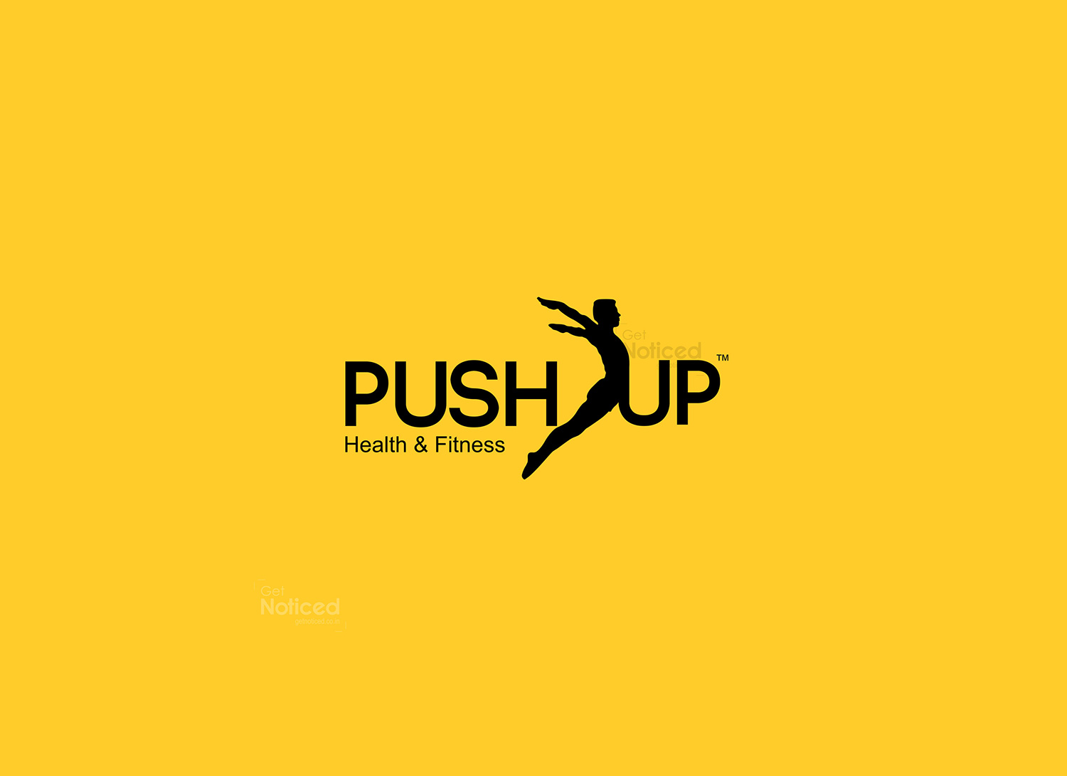
Client Approval and Final Logo: After presenting the sample logos to the client, we received their feedback and recommendations. Ultimately, the client approved the logo shown below:

The chosen logo featured a simple yet impactful design. To emphasize fitness, we incorporated a young and healthy man within the letter "U." This visual representation effectively conveyed the center's focus on health and exercise. The overall design exuded professionalism, capturing the client's vision of a brand that resonated with its target audience.

Conclusion: Crafting an impressive logo for PUSH UP, a renowned health and fitness center in Chennai, required a thorough understanding of the client's expectations and a creative approach. Our design team's collaborative efforts resulted in a logo that effectively communicated the essence of the brand. By combining elements of fitness and professionalism, we created a visually appealing and memorable logo that resonated with PUSH UP's target audience.