Protein Powder Bottle Label Packaging Design for Corsel Nutrition
Handled: Packaging Design, Health Care
Client Name: Corsel
Industry: Life Science Nutritionals
City: Chennai
Country: India
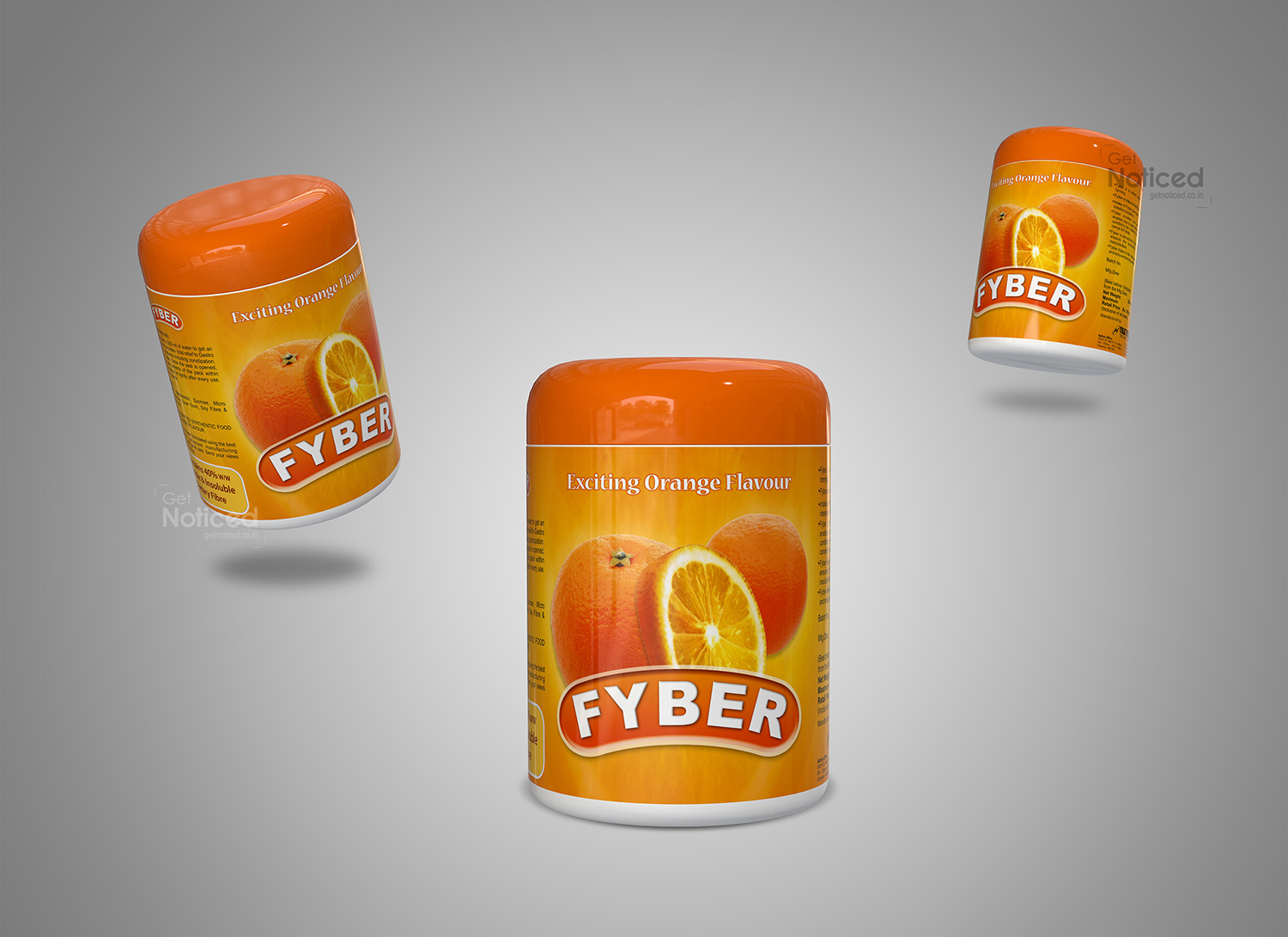
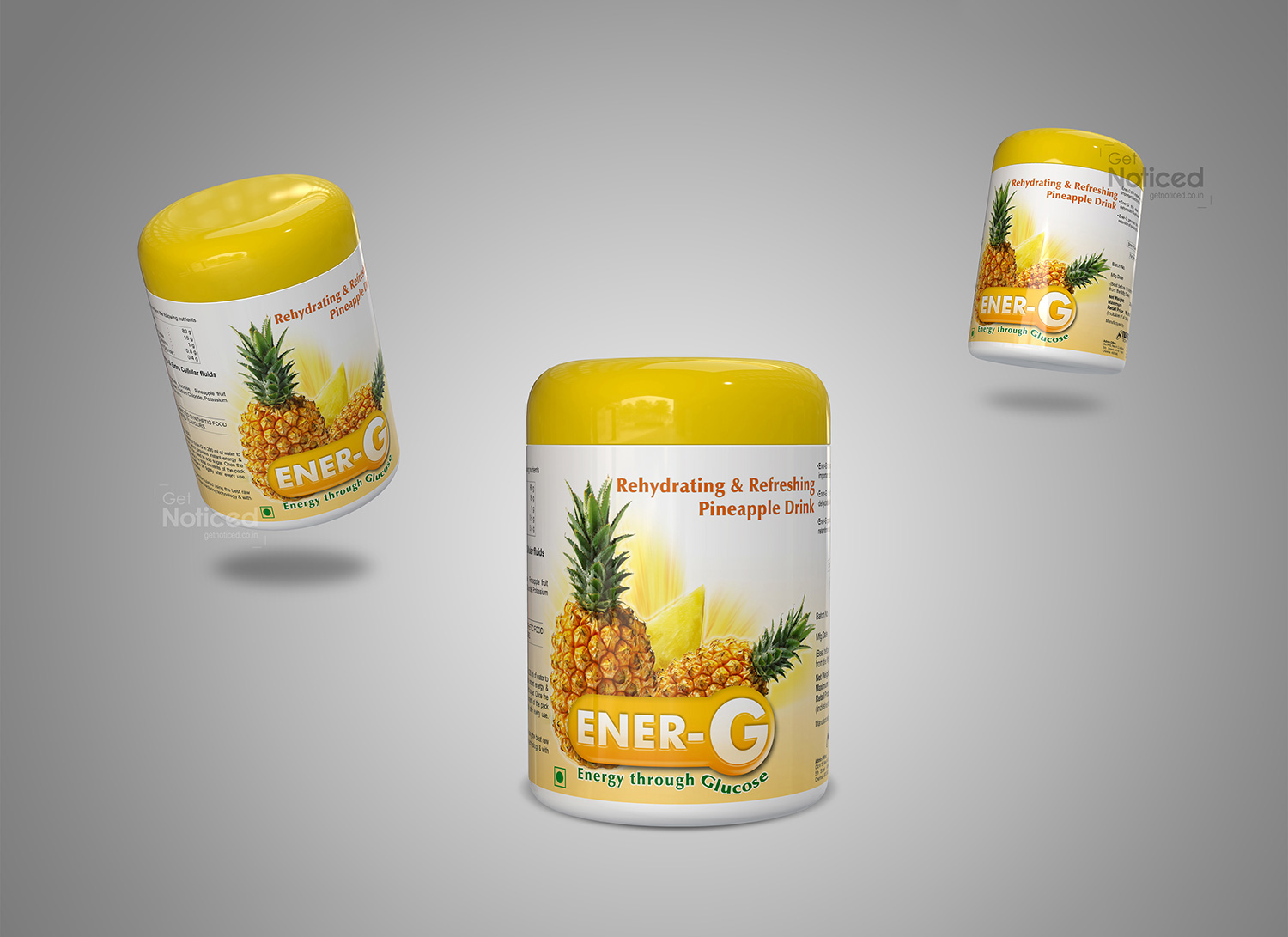
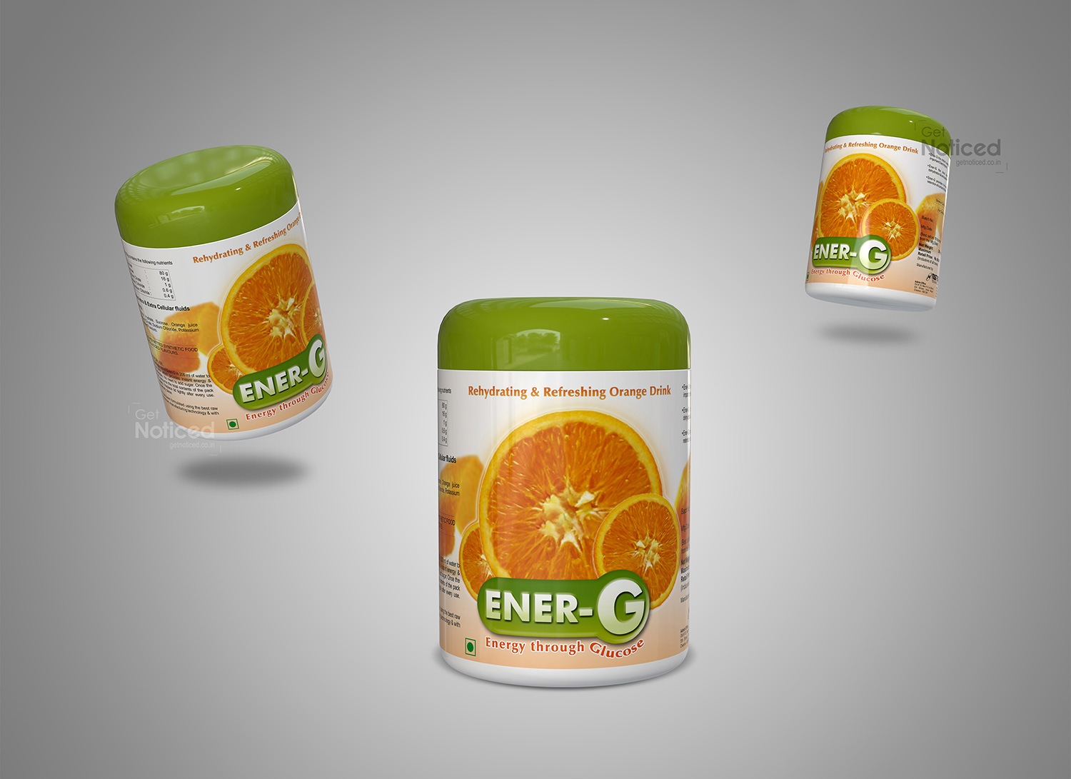
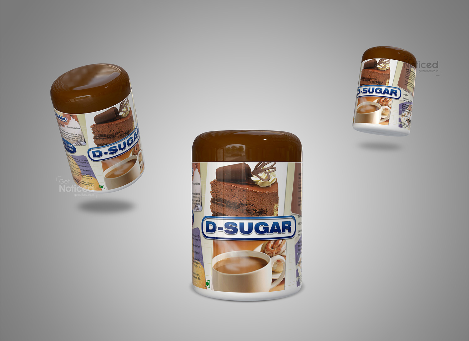
To create a high-impact presence in the competitive nutraceutical market, Get Noticed Creative Studio partnered with Corsel Nutrition to design a performance-driven bottle label for their protein powder drink range.
Our approach focused on developing a bold and structured brand identity design that communicates strength, energy, and product effectiveness. We crafted a visually dynamic system using strong typography, clean layouts, and strategic color differentiation to distinguish multiple flavors while maintaining brand consistency.
The label design was engineered for clarity and quick recognition, ensuring key nutritional benefits are prominently communicated without visual clutter. By aligning design aesthetics with consumer expectations in the fitness and wellness industry, the packaging delivers both shelf impact and brand credibility.
Built on corporate identity design principles, the final output reflects a scalable packaging system tailored for nutraceutical brands targeting premium global markets and performance-focused audiences.
What makes protein supplement packaging effective?
Strong visual impact, clear benefit communication, and structured design for quick recognition.
How should fitness products be represented through packaging design?
Through bold typography, energetic visuals, and performance-focused messaging.
Why is color differentiation important in supplement packaging?
It helps consumers easily identify flavors and product variants.
How does packaging influence trust in nutraceutical brands?
Professional design enhances credibility and positions the product as high quality.
Can packaging design improve product visibility in retail and online?
Yes, clear hierarchy and impactful visuals improve both shelf presence and digital appeal.
We collaborate with brands and founders who value long term brand building.
Let’s Discuss Your Brand


