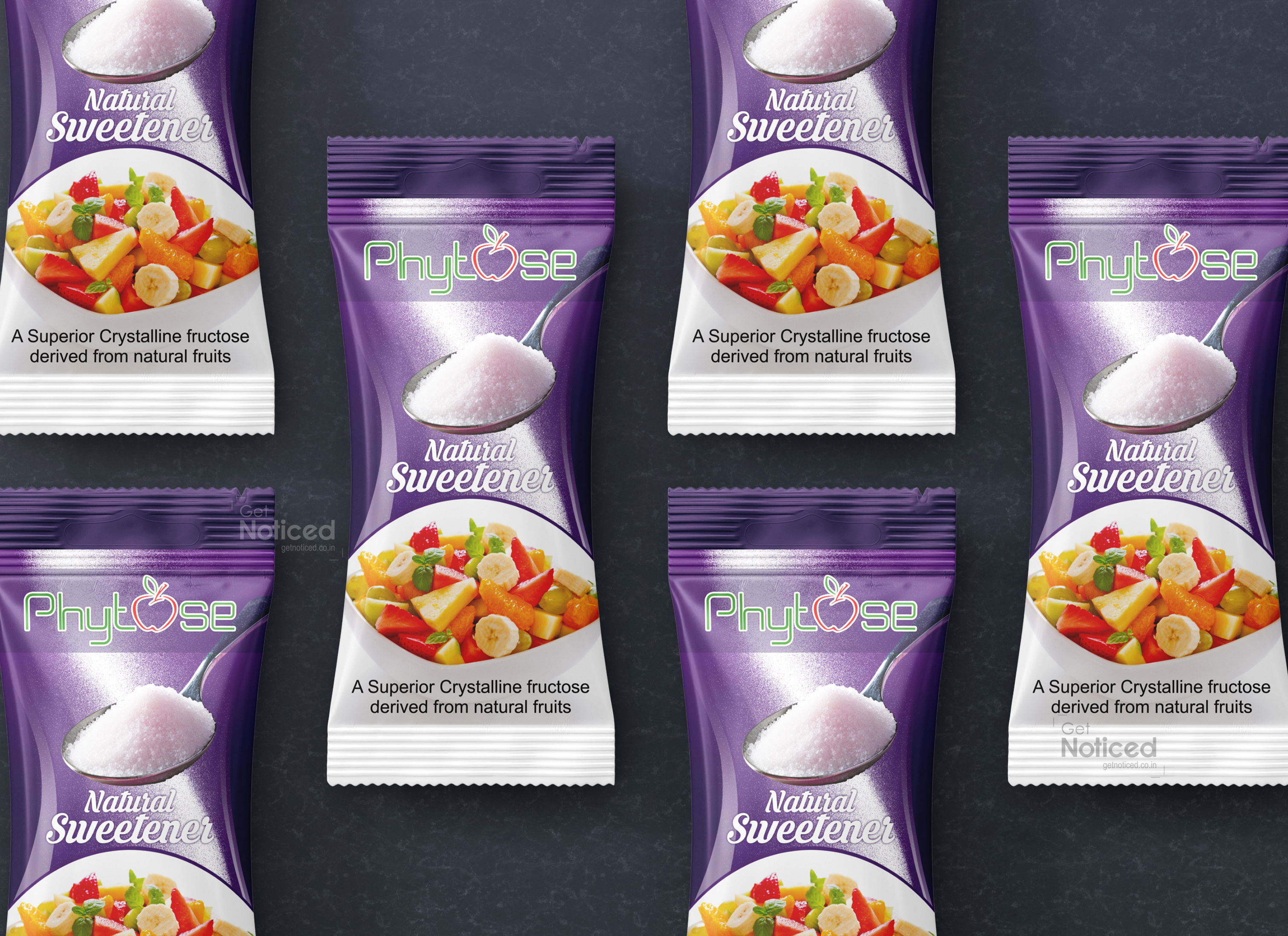
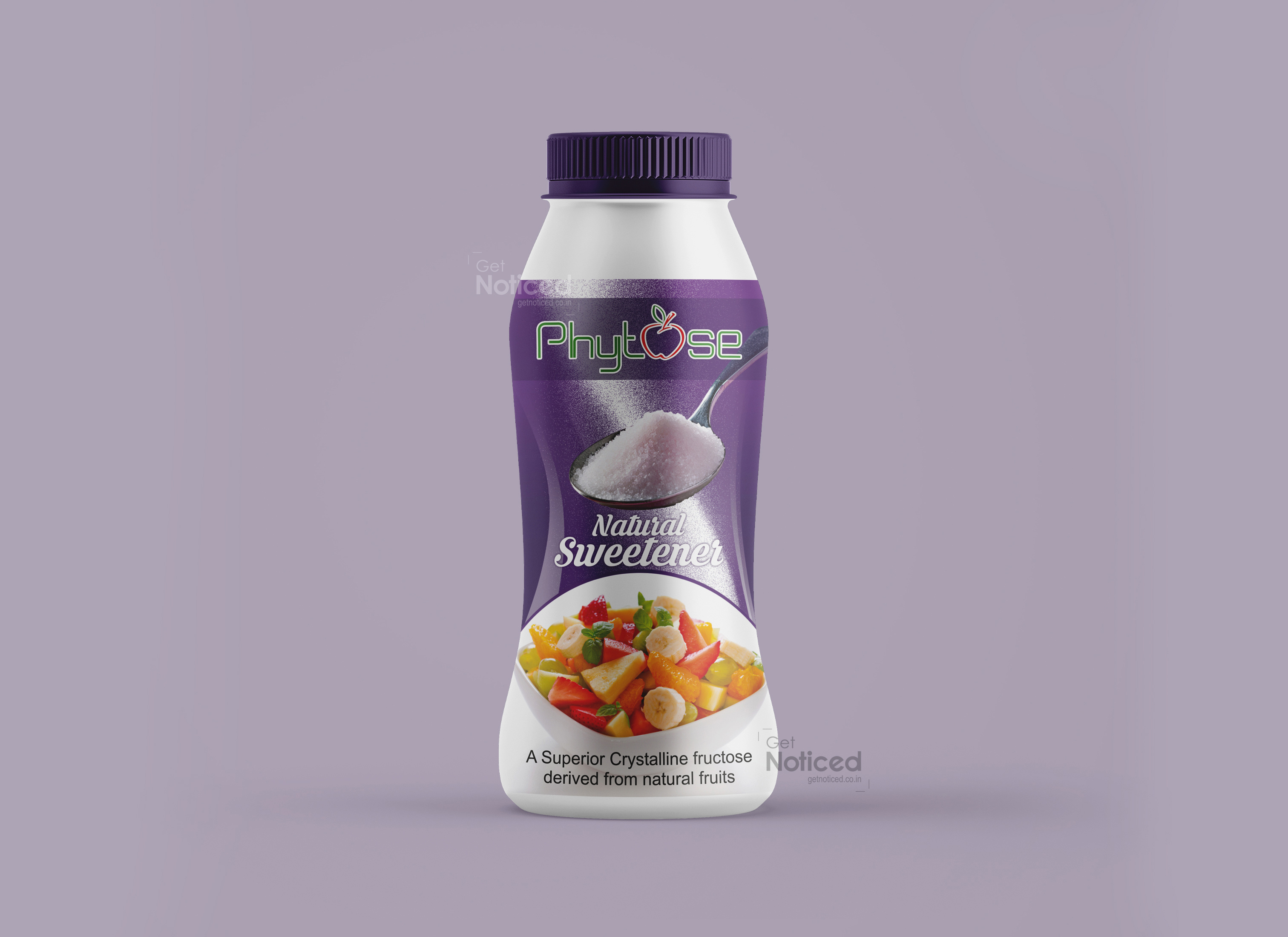
Phytose Sugar Free Bottle Label Design
Handled: Packaging Design, Health Care
Client Name: Phytose
Industry: Sugar Free
City: chennai
Country: india
Get Noticed Crafts Sweet Harmony: Phytose Sugar-Free Natural Sweetener Packaging Design
In the realm of health-conscious choices, Phytose has introduced a game-changer with its Sugar-Free Natural Sweetener, and at the heart of this transformative packaging is the creative ingenuity of the Get Noticed team. Entrusted with the task of creating a packaging design that communicates the essence of a sugar-free lifestyle, the team has seamlessly blended artistry with functionality, resulting in a label that not only showcases the purity of Phytose's sweetener but also symbolizes a commitment to wellness. Embracing the Sweetness of Nature The journey began with the Get Noticed team delving into the unique qualities of Phytose's Sugar-Free Natural Sweetener. Recognizing that this product is more than just a substitute for sugar – it's a lifestyle choice – the team set out to design a label that resonates with the brand's dedication to quality and natural sweetness.
Key Features of the Packaging Design: Nature-Inspired Color Palette: The label design for Phytose's sweetener embraces a palette inspired by the hues of nature. Soft greens, earthy browns, and pure whites create a visual symphony that communicates the natural, unprocessed sweetness of the product.
Clean and Minimalistic Aesthetics: The design is characterized by clean lines and a minimalistic approach, reflecting Phytose's commitment to simplicity and purity. The simplicity of the design ensures that the focus remains on the natural qualities of the sweetener.
Artful Imagery: Artistic depictions of natural sweetening ingredients – be it stevia leaves or other plant-based sources – adorn the label, creating a visual story that resonates with the origins of the product. The imagery reinforces the message of a sugar-free lifestyle derived from nature.
Informative Clarity: Clear and concise typography ensures that essential information about the product – ingredients, nutritional facts, and usage suggestions – is easily accessible to consumers. The fonts used strike a balance between modernity and a connection to nature.
Unveiling Natural Sweetness: Phytose Sugar-Free Sweetener Packaging
As Phytose's Sugar-Free Natural Sweetener graces the shelves, the packaging becomes a visual ambassador for a sugar-free lifestyle. The label isn't just an informational tag; it's an invitation to embrace sweetness in its purest form, straight from nature.
The Impact Get Noticed has successfully translated the essence of Phytose's Sugar-Free Natural Sweetener into a label design that not only informs but also delights. The packaging stands as a visual testament to Phytose's commitment to providing a sugar-free alternative that is not only healthier but also visually appealing.
In a market where health-conscious choices are becoming increasingly popular, Phytose's Sugar-Free Natural Sweetener, adorned with its striking label design, stands out as a symbol of sweetness derived from nature. Get Noticed has not merely designed a label; they've crafted a visual narrative that invites consumers to embrace a sugar-free lifestyle. It's not just a product; it's a visual celebration of wellness, encapsulated in every detail of its exquisite label.

