My Space Product Catalogue Design
Handled: Brochure Design, Product Catalogue
Client Name: My Space
Industry: Modular Kitchen Interior Designs
City: Chennai
Country: India
Other designs handled for My Space
MY SPACE Product Catalogue: Showcasing Exquisite Interior Designs
Introduction: At Get Noticed, we take immense pride in our ability to design captivating logos that reflect the essence of a brand. When My Space, a renowned modular kitchen and interior designer, approached us for their product catalogue, we were excited to embark on this creative journey. Understanding the significance of a well-designed catalogue in promoting products effectively, our team was determined to create a unique and visually appealing catalogue that would showcase My Space's exceptional interior designs.
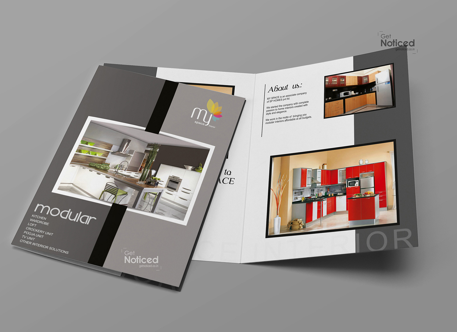
Crafting the Catalogue: We recognized that a professional catalogue design plays a crucial role in capturing the attention of potential clients. To achieve this, we carefully curated the layout, color scheme, and typography to create a visually striking design that would highlight My Space's offerings.
The combination of black and ash colors was chosen to provide a sophisticated and elegant backdrop for showcasing the exclusive interior designs. These colors worked harmoniously to enhance the accompanying images and create a visually cohesive aesthetic throughout the catalogue. By selecting a sleek and stylish font, we aimed to add a touch of modernity and professionalism to the overall design.
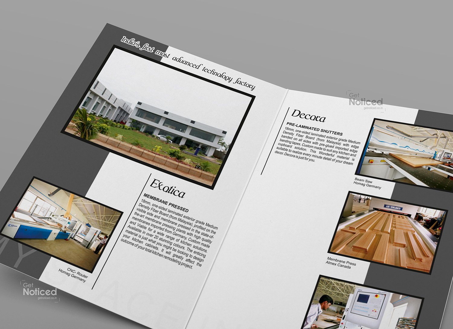
Showcasing Interior Designs: Each page of the catalogue was dedicated to a specific interior design project, accompanied by a brief description and corresponding images. We aimed to convey the unique features and artistic elements of each project through a combination of compelling visuals and concise descriptions. By providing a comprehensive overview of My Space's diverse range of interior designs, we aimed to inspire and captivate potential clients.
Printing and Finishing: To ensure a high-quality end product, we opted for A4-sized, four-page catalogues printed on 300gsm paper. The use of multicolor offset printing ensured vibrant and accurate color reproduction, bringing the interior designs to life on the pages. Additionally, each page was given a matte lamination finish, adding a touch of sophistication and protecting the catalogue from wear and tear.
Conclusion: The product catalogue designed by our team for My Space effectively showcases their exquisite interior designs, capturing the essence of their creativity and professionalism. The combination of black and ash colors, along with stylish typography, creates a visually appealing and cohesive design that speaks to My Space's brand identity. Through a combination of compelling visuals and concise descriptions, we have successfully conveyed the uniqueness and artistry of each interior design project. The high-quality printing and finishing ensure that the catalogue not only looks impressive but also stands the test of time. At Get Noticed, we are proud to be My Space's trusted design partner, and we are confident that this catalogue will play a pivotal role in showcasing their exceptional work and attracting potential clients.