Cleansely Packaging Design
Handled: Packaging Design, Miscellaneous
Client Name: Cleansely
Industry: Cleaning Products
City: Karur, Taminadu
Country: india
Other designs handled for Cleansely
Get Noticed Transforms Cleaning Essentials: Clencely Cleaning Liquids Packaging Design
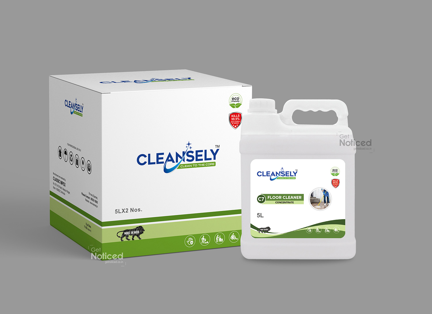
In the competitive realm of household cleaning, Clencely has emerged as a game-changer, and at the forefront of this transformation is the Get Noticed team. Entrusted with the task of redesigning the packaging for Clencely's Cleaning Liquids – both in cans and boxes – the team has seamlessly blended creativity with functionality, resulting in a packaging design that not only communicates the effectiveness of the cleaning solutions but also stands out as a visual statement of cleanliness and modernity. Embracing the Aesthetics of Cleanliness The journey commenced with the Get Noticed team immersing themselves in the unique qualities of Clencely's Cleaning Liquids. Understanding that these products are not merely functional but integral to creating a clean and hygienic home, the team set out to design packaging that resonates with the brand's commitment to quality and modern living.
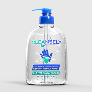
Key Features of the Packaging Design: Cohesive Branding Elements: The packaging design for Clencely's Cleaning Liquids maintains a cohesive visual identity. From cans to boxes, the incorporation of a unified color palette, logo placement, and typography creates a seamless brand experience that is instantly recognizable.
Clean and Modern Aesthetics: Clean lines, a contemporary color scheme, and modern typography contribute to an aesthetic that mirrors the cleanliness the products promise to deliver. The design ensures that the packaging itself communicates the brand's dedication to a modern and clutter-free lifestyle.
Strategic Imagery: Artful depictions of sparkling surfaces and the essence of cleanliness are strategically placed on the packaging. These images serve as a visual representation of the product's efficacy, inviting consumers to visualize the transformative power of Clencely's Cleaning Liquids.
Functional Design Elements: Whether it's the can design or the box design, functionality is a key consideration. Easy-to-use spouts on cans and convenient dispensers on boxes ensure that consumers can access the cleaning solutions efficiently while minimizing waste. Unveiling Modern Cleanliness: Clencely Cleaning Liquids Packaging Design As Clencely's Cleaning Liquids find their place on store shelves, the packaging becomes a visual testament to the brand's commitment to modern cleanliness. The label isn't just an informative tag; it's a visual representation of the ease and effectiveness Clencely brings to the art of cleaning.
The Impact Get Noticed has successfully translated the essence of Clencely's Cleaning Liquids into a packaging design that not only informs but also elevates the consumer experience. The packaging stands as a visual testament to Clencely's commitment to providing effective cleaning solutions that align with contemporary lifestyles.
In a market saturated with cleaning products, Clencely's Cleaning Liquids, adorned with its striking packaging design, stand out as a beacon of modernity and cleanliness. Get Noticed has not merely designed a label; they've crafted a visual narrative that invites consumers to embrace a new standard of cleanliness. It's not just a product; it's a visual celebration of modern living, encapsulated in every detail of its sleek and functional packaging.