Fortius Fud Logo Design
Handled: Logo Design, Healthcare & Medical
Client Name: Fortis
Industry: protein powder
City: Chennai
Country: india
Other designs handled for Fortis
Crafting the logo our innovative get noticed team for the brand name Fortius Fud Unveiling a Unique Identity
Introduction: In the realm of business, a logo serves as a powerful tool for expressing the essence of a company and establishing its brand identity. When tasked with designing a logo for Fourtius Fudz, a renowned industry specializing in health supplement drinks, our creative team embarked on a journey to create a visually striking and memorable symbol. Through careful research, brainstorming, and innovative thinking, we ultimately crafted a logo that perfectly encapsulates the spirit of Fourtius Fudz.
Research and Ideation: The initial step in our logo design process involved extensive research into various logos across different industries. We sought inspiration from successful brands, analyzing their use of colors, shapes, and typography to glean valuable insights. By examining these examples, we aimed to implement new and refreshing ideas into our own design for Fourtius Fudz.
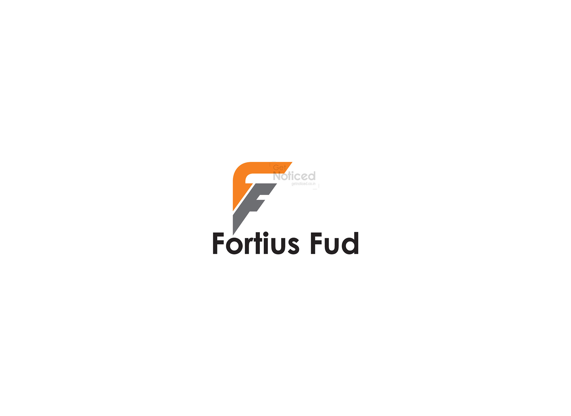
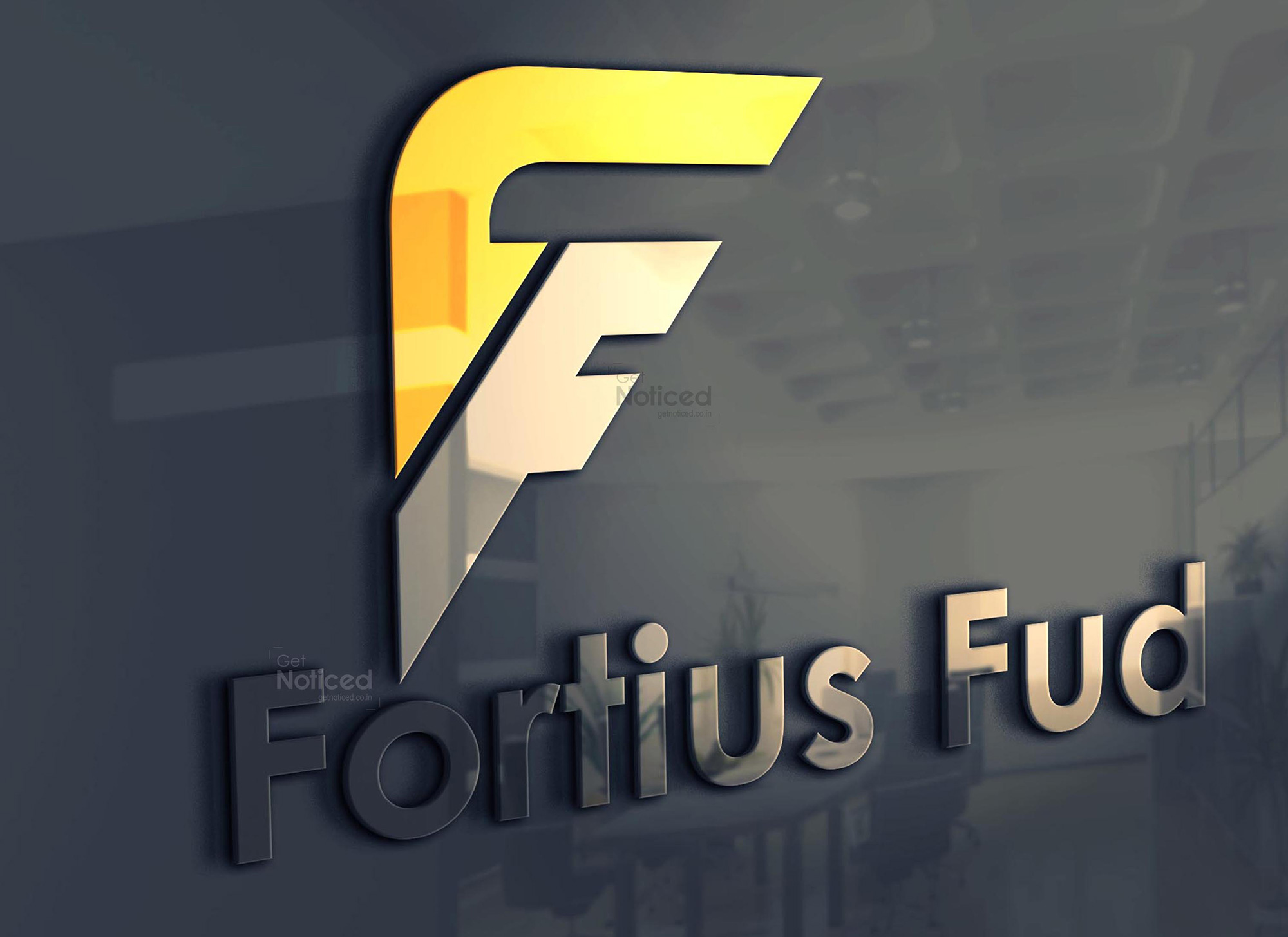
The Journey of the "F": Following a thorough exploration of logo design concepts, our team engaged in deep discussions to develop a distinctive and captivating logo for Fourtius Fudz. During this collaborative phase, an idea emerged to utilize the letter "F" as the foundation of the logo. To enhance its visual appeal and creativity, we decided to fashion the letter in a way that would cleverly showcase two "F's," subtly interweaving them within the design.
Finalizing the Design: With the concept in place, our team set to work on refining and polishing the logo design. Through multiple iterations and careful attention to detail, we fine-tuned the logo's proportions, lines, and spacing to ensure it exuded a sense of harmony and balance. Colors were chosen to complement the nature of Fourtius Fudz's health supplement drinks, evoking feelings of vitality and well-being.
Client Satisfaction: After presenting the client with four sample logos, each embodying the spirit of Fourtius Fudz, we received their valuable feedback. Ultimately, the design that resonated most with the client was the one that utilized the letter "F" to create a unique visual identity. The client expressed satisfaction with our ability to capture the essence of their brand while infusing it with an innovative touch.
Conclusion: Designing a logo that encapsulates the essence of a company and effectively communicates its identity is no small task. The process of crafting the Fourtius Fudz logo involved extensive research, brainstorming, and a keen eye for innovation. By utilizing the letter "F" in a creative manner, our team was able to construct a visually appealing logo that perfectly represents the brand and its health supplement drinks. With the client's satisfaction as our ultimate goal, we are proud to have played a role in creating a distinctive and memorable symbol for Fourtius Fudz.