Logo Design for Blue Green – Professional Branding for Corporate Services
Handled: Logo Design Design, Corporate & Services
Client Name: Blue & Green
Industry: Corporate Multi Services
City: Chennai
Country: India
Other designs handled for Blue & Green
For this corporate branding project, Get Noticed Creative Studio developed a structured and versatile logo design for Blue & Green, a multi-service company offering integrated business solutions across industries. The objective was to create a refined brand identity design that communicates reliability, adaptability, and operational clarity—key attributes for a comprehensive corporate services provider.
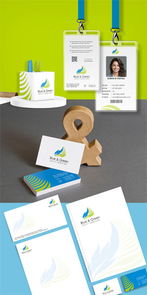
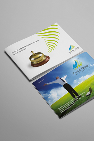
Our approach focused on translating complexity into a clean and organized visual identity. By combining modern typography with balanced geometric elements, we crafted a logo that reflects process-driven thinking, partnership, and efficiency. The design system ensures clarity and consistency across multiple touchpoints, including digital platforms, corporate documents, office environments, and business uniforms.
Positioned within a broader corporate identity design framework, the logo supports scalable application across business stationery design and brand communications.
The result is a professional and adaptable visual identity that positions Blue & Green as a dependable partner for integrated corporate solutions in a global business landscape.
What makes a logo design effective for corporate service companies?
An effective logo communicates structure, reliability, and professionalism while remaining adaptable across diverse business applications.
How does brand identity design support multi-service businesses?
It ensures consistency across various services, helping present a unified and credible brand to clients.
Why is clarity important in corporate identity design?
Clear design enhances communication, builds trust, and ensures the brand is easily recognized across all platforms.
Can a logo represent multiple services under one brand?
Yes, a well-designed logo uses flexible visual elements that allow it to represent a wide range of services cohesively.
What should companies expect from a professional logo design partner?
A strategic approach that simplifies complex services into a clear, scalable, and impactful visual identity.
We collaborate with brands and founders who value long term brand building.
Let’s Discuss Your Brand


