Manhattan Manpower Logo Design Manhattan Manpower Logo Design

Manhattan Manpower Logo Design

Handled: Logo Design, Corporate & Services

Client Name: Manhattan

Industry: Manpower Consultant

City: Singapore

Country: Singapore

Other designs handled for Manhattan

Crafting the Unique Logo for Manhattan by our get noticed team : A Start-up Employment Agency in Singapore

Introduction: In the competitive world of employment agencies, standing out from the crowd is crucial for success. When Manhattan, a start-up employment agency based in Singapore, sought a distinctive logo to represent their brand, they turned to our creative design team at Getnoticed.co.in. This article delves into the process by which our team brought their vision to life and crafted a logo that perfectly encapsulated Manhattan's essence.

Discovery and Initial Contact: Word of mouth can be a powerful tool, and in this case, it led Manhattan to our doorstep. One of our satisfied clients in Singapore recommended our logo designing services to the start-up. Intrigued by the endorsement, Manhattan reached out to our Getnoticed.co.in team, expressing their interest in creating a unique logo for their organization.

Understanding the Requirements: A successful logo design process begins with a comprehensive understanding of the client's vision and requirements. To achieve this, we initiated an interactive session with the client. Through this discussion, we gained insights into Manhattan's values, aspirations, and their target audience. Understanding their desire to become the leading employment agency for both freshers and experienced professionals in Singapore was key to our creative process.

Brainstorming and Conceptualization: With a clear understanding of Manhattan's aspirations, our creative team embarked on a brainstorming session. Our aim was to explore innovative ideas and concepts that would resonate with the client's vision and the unique nature of their brand. As the name "Manhattan" evokes associations with the bustling city in the United States, we decided to incorporate elements that would reflect this connection.

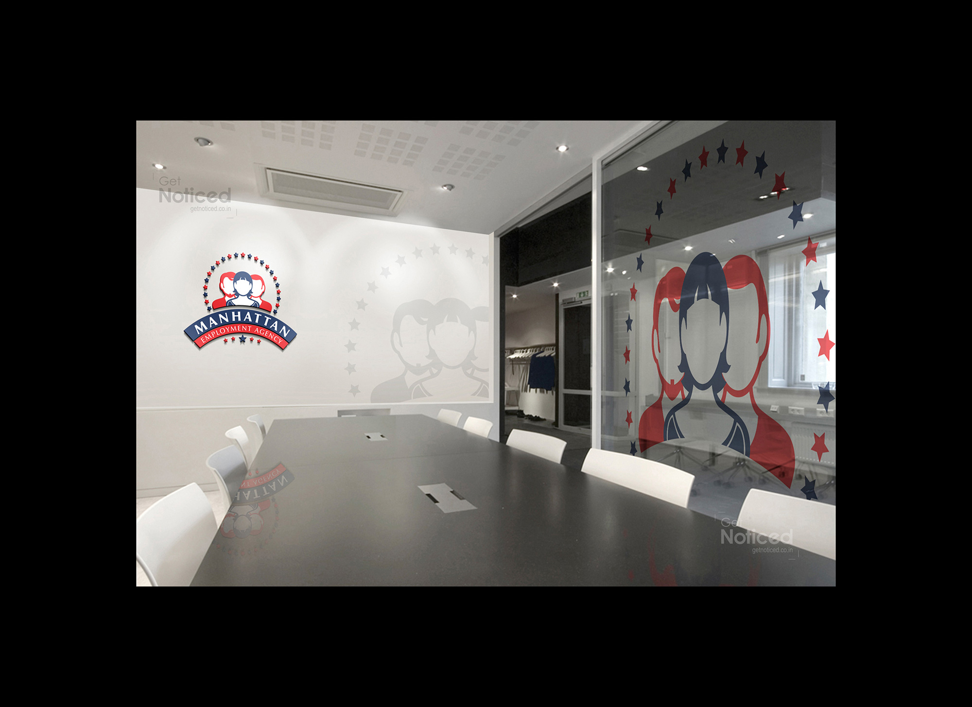
Design Implementation: Taking inspiration from the colors and stars found on the United States flag, we crafted a logo that visually represented Manhattan's essence. The use of red, white, and blue in the design not only paid homage to the American connection but also symbolized professionalism, trust, and efficiency—qualities synonymous with Manhattan's mission.

Furthermore, the logo design cleverly integrated three personalities behind the organization's name, highlighting Manhattan's ability to connect job seekers with the ideal employment opportunities. This element showcased their dedication to finding the right jobs for both freshers and experienced professionals, creating a sense of reliability and expertise.

Client Satisfaction: The final design was met with great enthusiasm from the client. Its distinctiveness and alignment with Manhattan's vision exceeded their expectations. The logo effectively conveyed their brand's message while establishing a strong visual identity in the competitive employment agency landscape of Singapore.

Conclusion: Crafting a logo that captures the essence of a brand is no easy feat. However, through a meticulous process of understanding, brainstorming, and design implementation, our creative team at Getnoticed.co.in successfully crafted a unique logo for Manhattan, a start-up employment agency based in Singapore. The design seamlessly integrates Manhattan's connection to the bustling city of the same name, while showcasing their dedication to helping job seekers find the right employment opportunities. With a satisfied client and a visually striking logo, Manhattan is now well-equipped to make its mark in the employment agency industry.