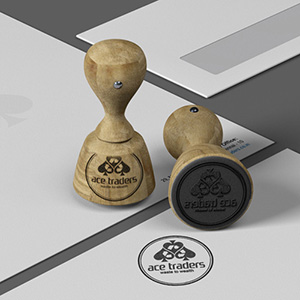
Ace Traders Logo Design
Handled: Logo Design, Export Import & Trade
Client Name: Ace Traders
Industry: Plastic Scrap Recycler
City: Chennai
Country: India
Other designs handled for Ace Traders
Crafting the ACE TRADERS Logo by our get noticed team: A Blend of Simplicity and Symbolism
Introduction: The importance of a well-designed logo cannot be overstated, especially when it comes to establishing a strong brand identity. When tasked with creating a logo for ACE TRADERS, a prominent player in the plastic recycling industry, our creative design team took on the challenge with enthusiasm. In this article, we will delve into the process that led to the creation of the ACE TRADERS logo, highlighting the key elements and concepts that make it stand out.
Understanding the Client's Vision: With a clear design brief from the client, our team knew that simplicity was paramount. The objective was to create a logo that would be easily recognizable and reflective of ACE TRADERS' industry leadership in plastic recycling. Armed with this information, we set out to develop four distinct logo samples, each offering a unique interpretation of the client's requirements.
Incorporating Symbolism: As the name "ACE" suggests, our design team sought to integrate elements that would represent excellence and expertise. The concept of the "ace spade" emerged as a compelling symbol that embodied these qualities. The spade, traditionally associated with playing cards, is often depicted as the highest-ranking symbol, synonymous with skill and victory. By incorporating the ace spade into the logo, we aimed to convey ACE TRADERS' position as a leader in their industry.
Innovative Integration of Recycling Symbol: An additional challenge we faced was how to incorporate the crucial aspect of plastic recycling into the logo without sacrificing its simplicity. Initially, we hesitated to include the universal recycling symbol due to concerns about cluttering the design. However, our extensive research on effective logo design provided a breakthrough. We discovered a way to seamlessly integrate the recycling arrows within the contours of the ace spade, striking the perfect balance between symbolism and simplicity.
The Final Logo: After presenting the four logo options to the client, it was evident that the design featuring the ace spade with the embedded recycling arrows stood out from the rest. This particular logo encapsulated the essence of ACE TRADERS' commitment to excellence, while simultaneously representing their core business of plastic recycling. The incorporation of the recycle symbol within the spade served as a visual testament to the company's dedication to sustainability and environmental responsibility.
Conclusion: Crafting the perfect logo for ACE TRADERS required a thoughtful approach that balanced simplicity and symbolism. By embracing the concept of the ace spade and ingeniously integrating the recycling arrows, our creative design team succeeded in creating a logo that resonated with the client's vision. The final logo not only embodies the leadership and excellence of ACE TRADERS in the plastic recycling industry but also communicates their commitment to environmental sustainability. Through meticulous research and innovation, our team ensured that ACE TRADERS' logo will make a lasting impression on both clients and consumers alike.