Asma & Alisa Logo Design
Handled: Logo Design, Food & Beverages
Client Name: Asma & Alisa
Industry: Tea Products
City: Singapore
Country: Singapore
Other designs handled for Asma & Alisa
Creating an Exclusive Logo for ASMA & ALISA by the team get noticed : A Story of Personal Connection and Creativity
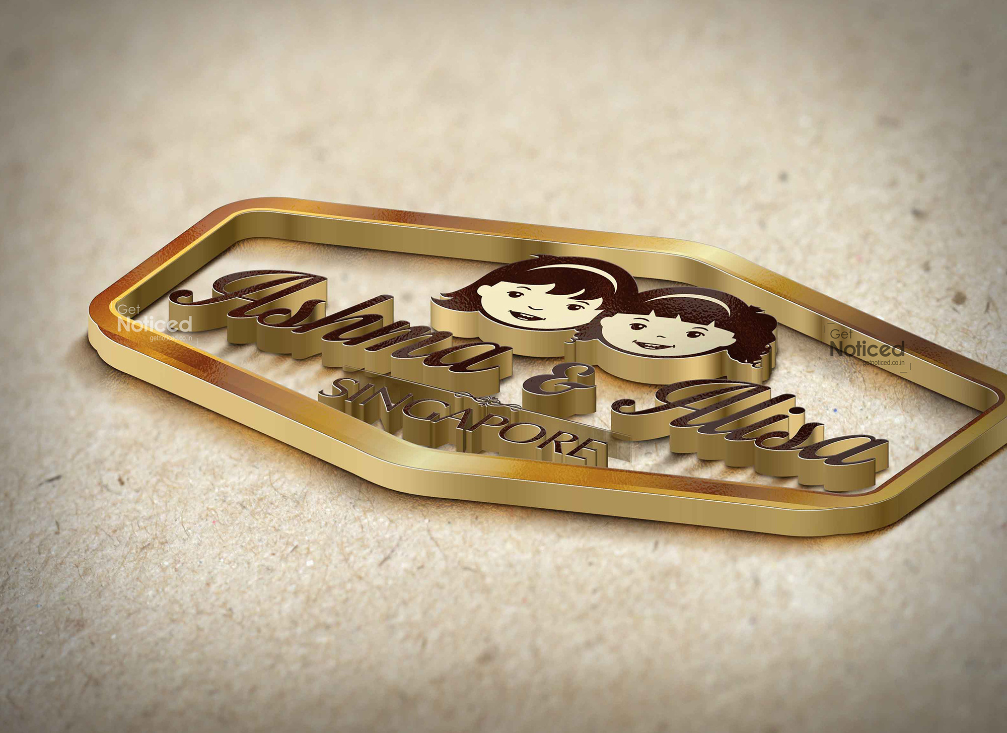
Introduction: Designing a logo that perfectly captures the essence of a brand is a challenging task. However, our creative design team recently had the opportunity to craft an exclusive logo for "Ashma and Alisa," a Singapore-based green tea manufacturer. This article delves into how our team approached the project and successfully designed a logo that represented the client's children.
Understanding the Client's Vision: During our initial interaction with the client, they revealed that "Ashma and Alisa" were the names of their beloved children. This information instantly provided us with a unique direction for the logo design. Our client's ultimate request was to create a logo that would embody the spirit of their children, giving us a strong starting point for the creative process.
The Design Process: Adhering to our standard design procedure, we set out to develop four sample logos for the client. However, to our pleasant surprise, the client was captivated by the very first logo concept we presented. This initial design showcased the impression of two girls' faces, representing the names "Ashma and Alisa."
Creating Symbolic Representation: To effectively portray the client's children in the logo, our design team carefully crafted the details. The logo featured two distinctive faces, each representing one of the children. We aimed to capture the unique characteristics and personalities of Ashma and Alisa, ensuring that the design resonated with the client on a personal level.
Symbolism and Significance: The decision to use the girls' faces in the logo held profound symbolism. By incorporating these distinct facial impressions, we were able to establish a deep emotional connection between the brand and the client's children. The logo not only served as a representation of the company but also acted as a tribute to the client's cherished family members.
Delighting the Client: Upon presenting the final logo design, our team felt an immense sense of satisfaction. The client's excitement and approval were a testament to our efforts and creative expertise. By successfully capturing the essence of "Ashma and Alisa" through the logo, we were able to fulfill the client's vision and exceed their expectations.
Conclusion: Designing a logo that encapsulates the spirit of a brand and resonates with the client is a remarkable achievement. In the case of "Ashma and Alisa," our creative design team took on the challenge of representing the client's children through an exclusive logo design. By utilizing the impression of two girls' faces, we created a symbol that not only represents the brand but also pays homage to the client's beloved family members. This project stands as a testament to our team's creativity, attention to detail, and ability to create meaningful designs that leave a lasting impact.