Frizz Stone Logo Design
Handled: Logo Design, Food & Beverages
Client Name: Frizz Stone
Industry: Ice Cream Parlour
City: Salem
Country: India
Other designs handled for Frizz Stone
The Creative Journey: Crafting the Logo for Frizz Stone by get noticed logo designing team
Introduction: Creating a captivating logo that embodies the essence of a brand requires a harmonious partnership between the designing team and the client. In the case of Frizz Stone, a band that had been working with our team for over 10 years, this partnership evolved as they approached us once again for a new and exciting venture. This time, it was the introduction of an American-style ice cream concept parlour in India under the brand name Frizz Stone. Through effective communication and a deep understanding of their vision, we embarked on a logo design process that resulted in a visually striking word mark type logo.
Understanding the Client's Vision: Having worked closely with Frizz Stone in the past, we already had a strong understanding of their preferences and design aesthetic. After the client expressed their desire for a word mark type logo, where the brand name would be highlighted in the form of graphic calligraphy, we knew the direction we needed to take.
Providing Options: While the client had a clear vision in mind, we believed in presenting them with multiple options to ensure they had a range of choices. After carefully considering their requirements and conducting thorough research, we developed three distinct logo concepts that showcased different interpretations of the Frizz Stone brand.
Refining the Chosen Concept: Among the three options presented, the client selected the second concept as their preferred choice. However, our journey did not end there. We engaged in open dialogue with the client, seeking their feedback and understanding their preferences for color combinations and any necessary revisions.
Collaborative Iterations: Working closely with the client, we refined the chosen logo concept, making adjustments to the calligraphy style, proportions, and overall composition. Through this iterative process, we ensured that the final design truly reflected the client's vision while maintaining a strong brand identity.
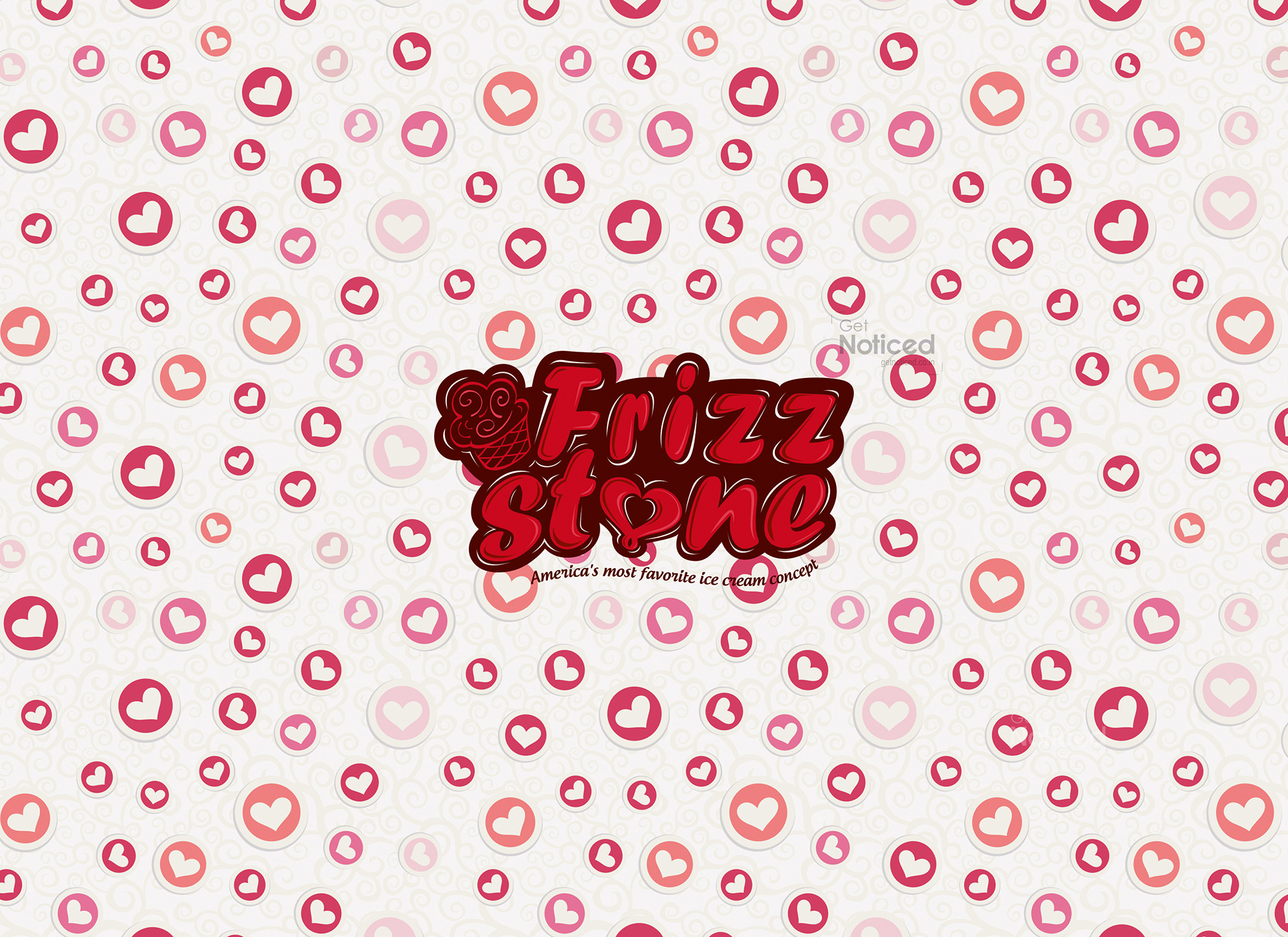
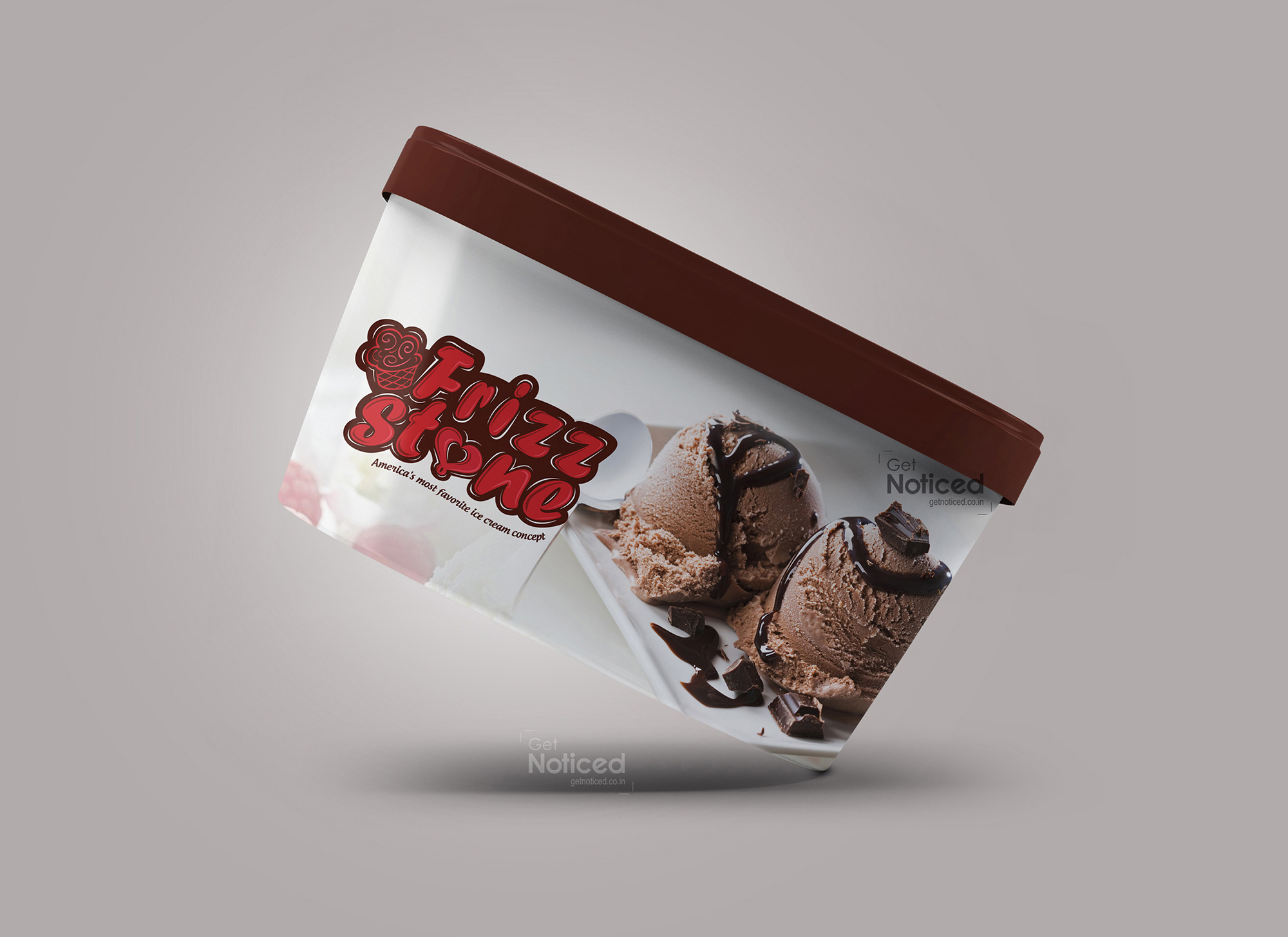
Result: The final logo design for Frizz Stone's ice cream concept parlour embodies the essence of their brand. The word mark logo, with its beautifully crafted calligraphy, captures the attention of onlookers, evoking a sense of indulgence and excitement. The carefully chosen color combinations further enhance the brand's identity, ensuring that it stands out in a competitive market.
Conclusion: The journey of creating the logo for Frizz Stone's ice cream concept parlour was a testament to our long-standing partnership with the client. Through effective communication, collaborative iterations, and a deep understanding of their vision, we were able to craft a logo that truly represents their brand. This project not only showcased our team's creativity and expertise but also strengthened our relationship with Frizz Stone, as we continue to support them in their endeavours to bring joy and delicious treats to ice cream enthusiasts in India.