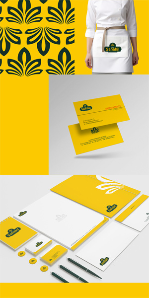
Sanabil Logo Design
Handled: Logo Design, Food & Beverages
Client Name: Sanabil
Industry: Super Market
City: Selangore
Country: Malaysia
Other designs handled for Sanabil
Crafting the Captivating Logo for SANABIL by get noticed logo designing team : A Creative Designing Triumph
Introduction: In today's competitive business landscape, a well-designed logo plays a pivotal role in capturing the attention of potential customers and conveying the essence of an organization. Recognizing this significance, SANABIL, a prominent food and beverage industry player in Malaysia, approached our creative designing team to create a captivating logo that would effectively represent their brand. Through careful collaboration and meticulous attention to detail, we crafted a logo that surpassed expectations and left our client thoroughly satisfied.
Understanding Client Requirements: At the onset of the project, we engaged in an extensive interaction session with SANABIL to gain a comprehensive understanding of their vision, values, and aspirations. Their primary objective was to attract new customers and establish a strong brand identity in the market. Armed with this knowledge, we embarked on a journey to design a logo that would achieve these goals while staying true to the essence of SANABIL.
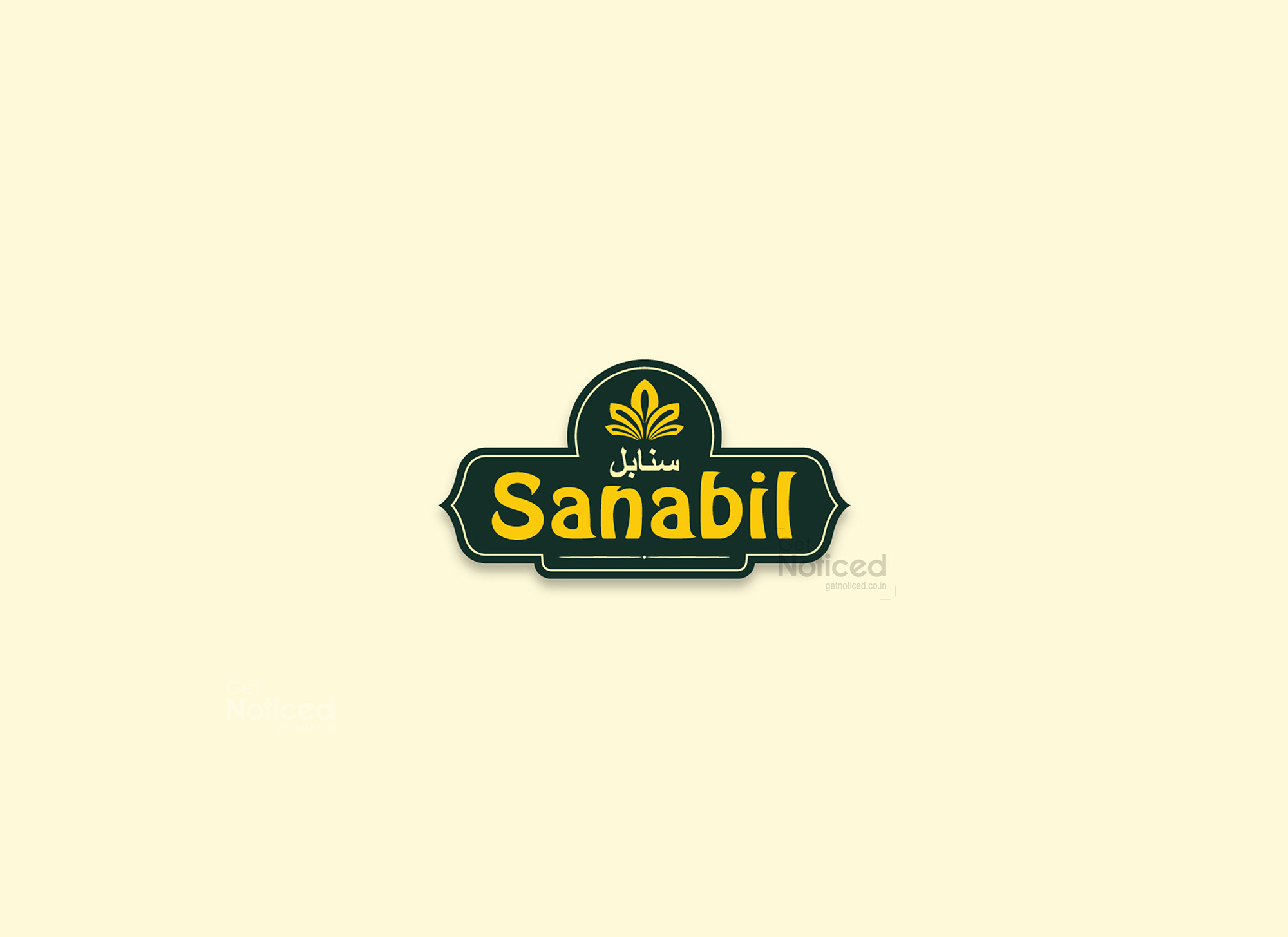
Creating an Eye-Catching Design: Drawing inspiration from the client's requirements, we embarked on the creative process of crafting a logo that would make an indelible impression on viewers. Our design team meticulously chose fonts that were bold and expressive, ensuring the organization's name, "Sanabil," stood out prominently. This deliberate choice aimed to create instant recognition and brand recall, a crucial aspect for effective customer engagement.
The Impact of Simplicity: Incorporating simplicity into the logo design was another important aspect of our creative strategy. We recognized the significance of a clean and sharp aesthetic to convey professionalism and attention to detail. With this in mind, we decided to enclose the name "Sanabil" within a simple, sharp-edged boundary. This approach not only added visual appeal but also communicated a sense of sophistication, subtly hinting at the organization's commitment to excellence.
Client Satisfaction: Upon presenting the final design to SANABIL, we were met with utmost satisfaction and approval. The logo captured the essence of the brand while effectively conveying its values and attracting potential customers. Our client acknowledged the logo's ability to make a considerable impact in the market and expressed their contentment with our work.
Conclusion: Crafting a logo that resonates with an organization's values and captures the attention of customers is a task that requires creativity, understanding, and collaboration. In the case of SANABIL, our dedicated designing team successfully fulfilled the client's requirements and created a logo that exceeded expectations. By employing bold fonts, incorporating a sharp-edged boundary, and embracing simplicity, we achieved a visually striking design that effectively represents the organization in the competitive food and beverage industry.