Brack Logo Design
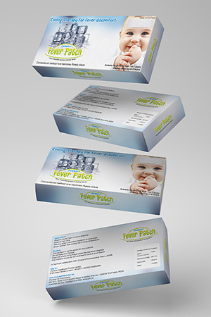
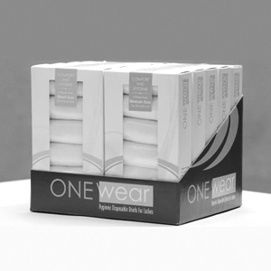
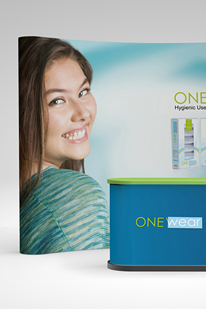
Handled: Logo Design, Healthcare & Medical
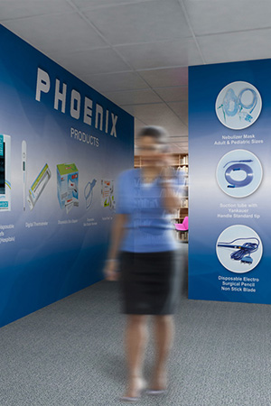
Client Name: Phoenix
Industry: Health Care Products
City: Liverpool
Country: United Kingdom
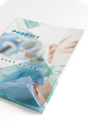
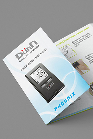
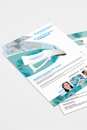
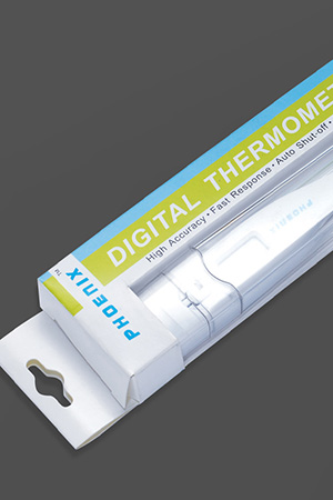
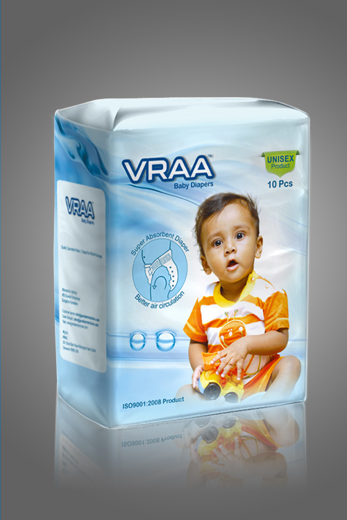
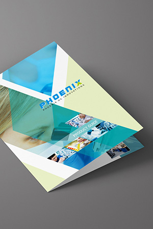
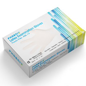
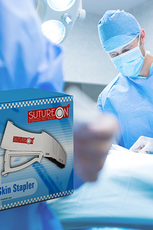
Other designs handled for Phoenix
how our get noticed team Crafted the Perfect Logo for BRACK: Representing Excellence in Polypropylene Monofilament Mesh for Hernia Surgeries
Introduction: Logo design is a crucial aspect of brand identity, and when the creative prowess of a design team combines with the vision of a client, remarkable results can be achieved. Such was the case when our creative designing team collaborated with BRACK, the leading producer of polypropylene monofilament mesh for hernia surgeries. In this article, we delve into the process and inspiration behind the logo design that effectively represents the nature of their business.
Client Interaction: Upon approaching our team, BRACK expressed their need for a visually appealing logo that would encapsulate their expertise in producing high-quality polypropylene monofilament mesh for hernia surgeries. Our initial step was to hold an interactive session with the client, where we gained insights into their brand values, target audience, and desired visual elements.
Design Exploration: Armed with a comprehensive understanding of BRACK's objectives, our creative team began brainstorming and conceptualizing various logo design ideas. We adhered to established logo design principles, such as simplicity, memorability, and scalability, to ensure the final logo would effectively represent the brand and leave a lasting impression.
Sample Logos: After generating a range of ideas, we crafted four distinct sample logos for BRACK. Each design aimed to reflect the nature of their business and evoke a sense of professionalism and trustworthiness. These samples were presented to the client, who was actively involved in the selection process.
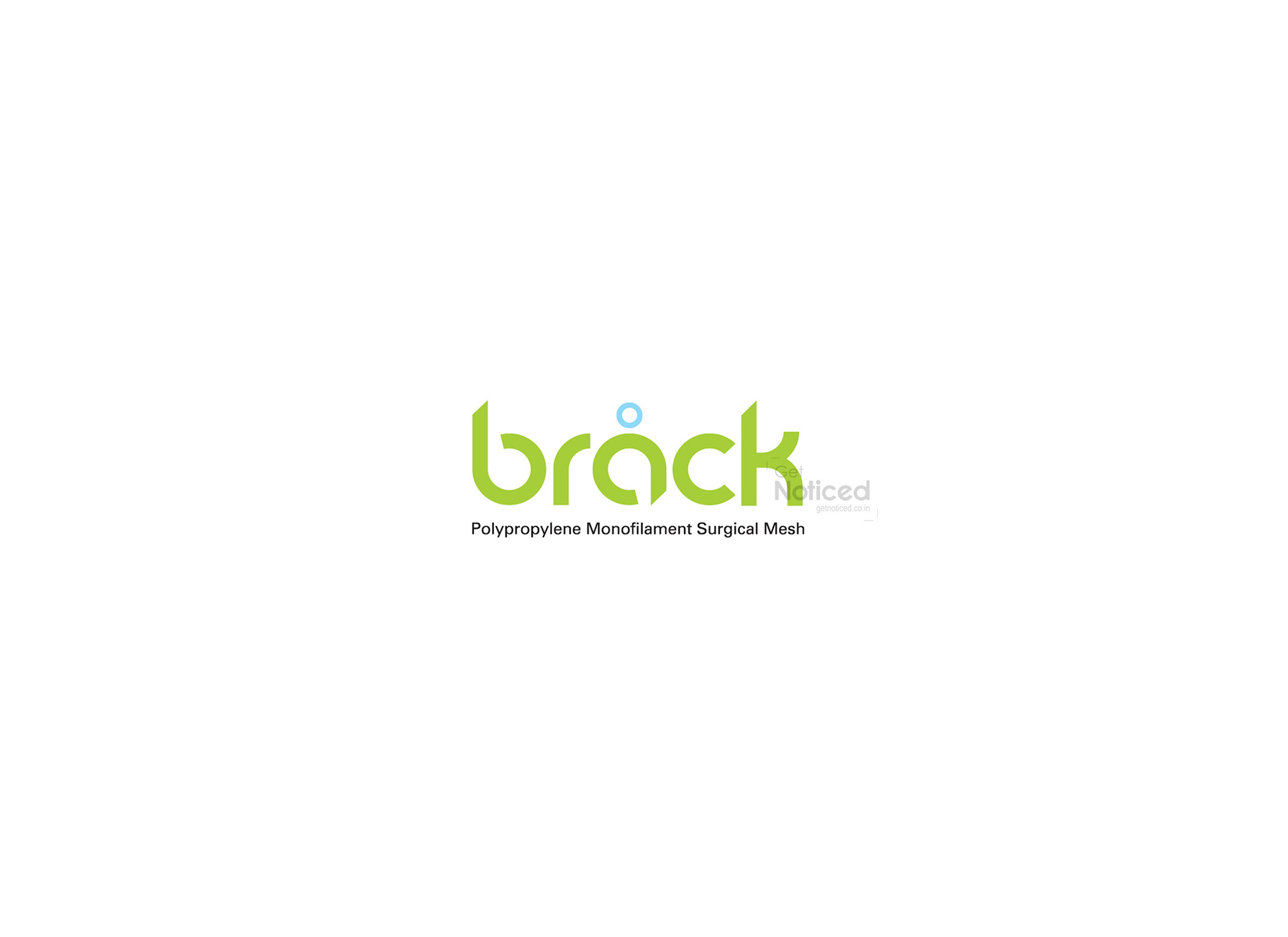
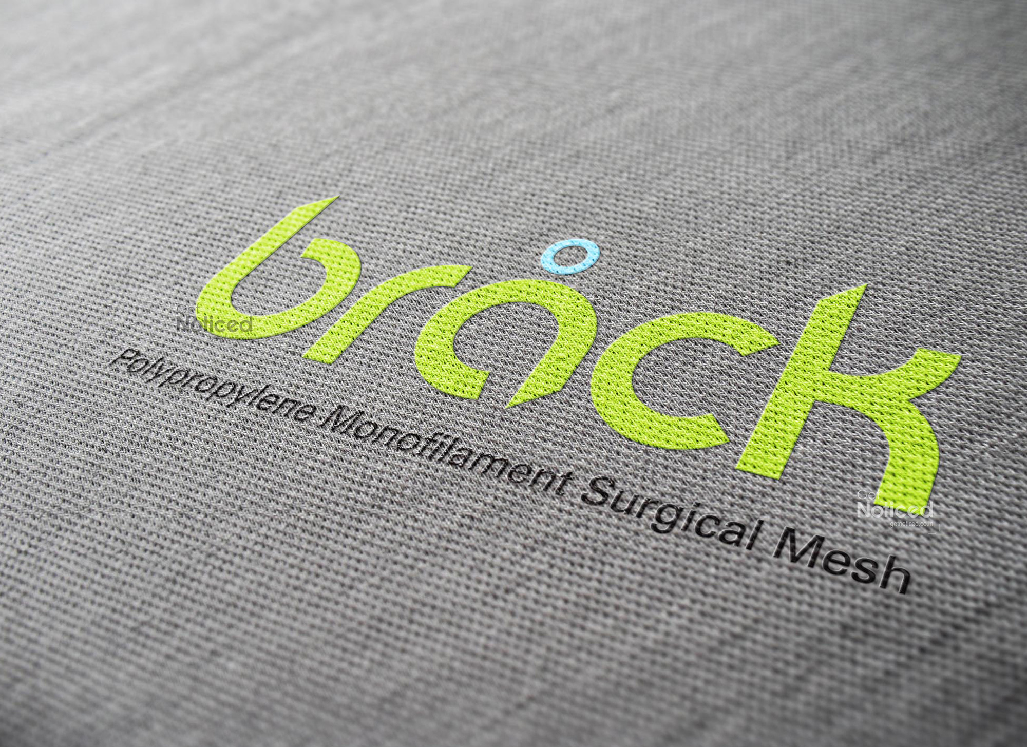
The Chosen Logo: Among the four sample logos, one stood out and captivated the client's attention. This logo creatively incorporated elements that conveyed the essence of BRACK's product and industry.
Symbolism and Significance: Understanding that mesh is a net-like structure composed of interconnected threads and perforations, we decided to emphasize the concept of holes in the logo design. By emphasizing the holes, we effectively represented the intricacies and functionality of a mesh. This visual depiction helped convey BRACK's specialization in polypropylene monofilament mesh for hernia surgeries.
Incorporating the Brand Name: Above the symbol, we strategically placed a small representation of a surgical tool. This addition not only reinforced the nature of BRACK's business but also served as a subtle visual cue to potential customers. The tool served as a reminder of the precision and quality associated with the brand.
The Final Logo: Throughout the iterative design process, our team collaborated closely with the client, fine-tuning and perfecting the chosen logo. The end result was a visually appealing, highly relevant logo that encapsulated BRACK's expertise and commitment to excellence in the production of polypropylene monofilament mesh for hernia surgeries.
Conclusion: Crafting an effective logo requires a deep understanding of a client's brand values, combined with creative design expertise. In the case of BRACK, our collaborative efforts resulted in a logo that not only captured the essence of their business but also left a lasting impression on their target audience. The chosen logo's emphasis on the mesh and the subtle representation of a surgical tool showcased BRACK's commitment to quality and precision in their field. As a design team, we take pride in helping our clients establish a visual identity that resonates with their customers and sets them apart from the competition.