Orion Guest House Logo Design
Handled: Logo Design, Hotel & Resorts
Client Name: Orion
Industry: Guest House
City: Chennai
Country: India
Other designs handled for Orion
get noticed creative team Crafting the Perfect Logo for ORION Guest House: A Design Success Story
When the creative designing team at our studio was approached by ORION Guest House to create their logo, we knew we had an exciting challenge ahead. The client had a tight deadline in mind, requesting the logo to be delivered within a week. With enthusiasm and determination, we set out to create a design that would capture the essence of their brand.
Our first step was to brainstorm and generate a variety of concepts. We wanted to ensure that we explored different ideas and approaches to create a logo that would truly stand out. After several brainstorming sessions, we narrowed down our options to four sample logos that we believed had the potential to represent ORION Guest House effectively.
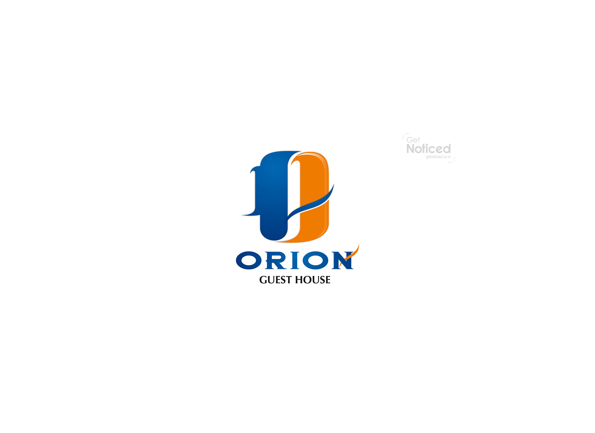
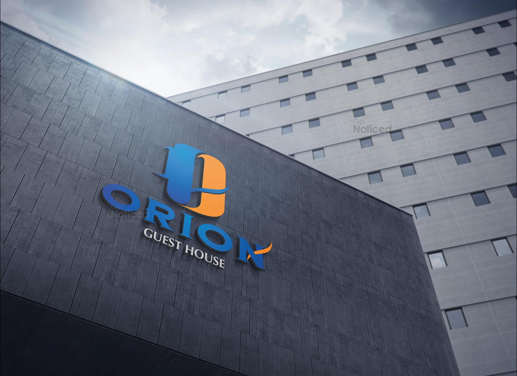
During our design process, we had a breakthrough idea. We decided to utilize the letter "O" in a unique and imaginative way, symbolizing the Orion house. To make the logo visually striking, we employed two different colors for the letter "O." This decision added depth and visual interest to the design, making it visually captivating.
Additionally, we wanted to incorporate the idea of luxury into the logo. To achieve this, we crafted a gentle curve that seamlessly connected the two sections of the letter "O." This elegant curve formed the shape of an "H," subtly highlighting the luxurious aspect of the guest house. This simple yet clever touch enhanced the overall impact of the logo.
Throughout the design process, we remained in close communication with the client, sharing our progress and exchanging feedback. We valued their input and worked collaboratively to ensure the final logo met their expectations. Our dedication to their vision and our creative expertise resulted in a logo that both parties were satisfied with.
The chosen logo beautifully captured the essence of ORION Guest House. Its innovative use of the letter "O," combined with the elegant curve forming the "H," showcased the luxurious and distinctive qualities of the brand. The logo successfully conveyed the message that ORION Guest House is a place where guests can experience comfort and sophistication.
We take pride in our ability to rise to challenges and deliver exceptional designs under tight deadlines. The ORION Guest House logo project was a testament to our team's creativity, professionalism, and commitment to client satisfaction.
In conclusion, the creation of the logo for ORION Guest House was a journey of collaboration and innovation. By thinking outside the box and exploring fresh ideas, we were able to design a logo that effectively represented the brand's identity. We are proud of the final result and grateful for the opportunity to work with ORION Guest House.