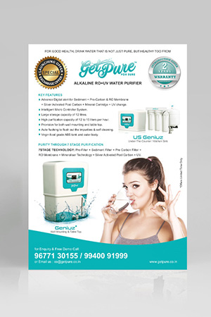
Logo Design for GetPure Water - Clean and Trustworthy Brand Identity
Handled: Logo Design Design, Industry
Client Name: Get Pure
Industry: Ro Water Purifier
City: Pune, Maharashtra
Country: India
Other designs handled for Get Pure
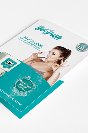
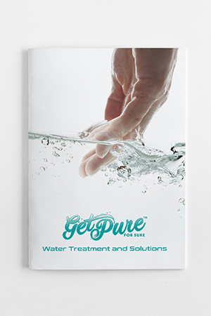
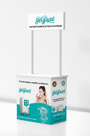
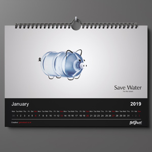
For this clean-tech branding project, Get Noticed Creative Studio partnered with Get Pure to craft a refined visual identity that communicates clarity, innovation, and trust in the water purification sector. The objective was to move beyond a conventional product-focused approach and establish a brand presence that reflects reliability and long-term value in a health-conscious global market.
Our approach centered on designing a sleek, minimal logo built with modern typography and subtle water-inspired visual cues. The identity conveys purity, precision, and technological advancement while maintaining a calm and approachable aesthetic. Every element was carefully structured to reinforce credibility—an essential factor in industries where safety and trust directly influence customer decisions.
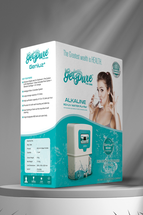
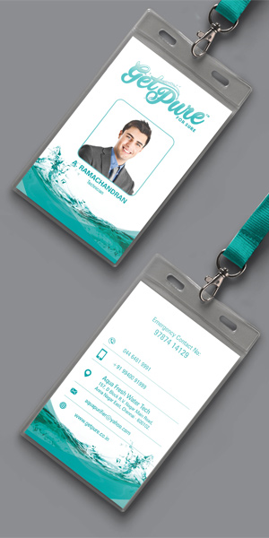
Designed for versatility, the identity adapts seamlessly across product units, packaging, service materials, and digital platforms. This strategic foundation supports a complete brand identity design, enabling expansion into corporate identity design and business stationery design, ensuring consistent brand communication as the company scales across markets.
What makes a water purifier brand logo effective?
An effective logo emphasizes clarity, simplicity, and trust, using clean design elements that reflect purity and reliability.
Why is brand identity design important for clean-tech products?
Brand identity design builds credibility, differentiates the product, and creates a consistent experience across all customer touchpoints.
How can a health-focused brand build customer trust through design?
By using minimal, clear visuals and consistent branding, a company can communicate safety, transparency, and reliability.
What role does corporate identity design play in product-based businesses?
Corporate identity design ensures consistent branding across packaging, communication, and service materials, strengthening brand recognition.
How does logo design impact product perception in competitive markets?
A well-crafted logo enhances perceived quality, builds trust, and supports premium positioning in crowded markets.
We collaborate with brands and founders who value long term brand building.
Let’s Discuss Your Brand