Mikosys Logo Design
Handled: Logo Design, Industry
Client Name: Mikosys
Industry: Large Format Digital Printing
City: Chennai
Country: India
Other designs handled for Mikosys
Crafting the MIKOSYS Logo: A Creative Journey by get noticed logo designing team
Introduction: Designing a logo that captures the essence of a brand can be a challenging task. However, when our creative designing team received a proposal from Mikosys, a renowned provider of high-quality printers for outdoor advertising, we saw an opportunity to showcase our skills. Through collaboration and innovation, we successfully crafted a logo that not only represented Mikosys but also stood out in the competitive market.
Design Brief and Initial Discussions: The first step in our design process was to engage in detailed discussions with the client to understand their vision and goals. We delved into the essence of Mikosys and their reputation for delivering exceptional services. This design brief became the foundation for our creative journey, allowing us to align our concepts with the client's requirements.
Exploration and Inspiration: To bring fresh ideas to the table, our team embarked on a thorough exploration of various logo designs. We delved into different styles, themes, and visual representations to find inspiration that would resonate with Mikosys' target audience. Our goal was to create a logo that would not only be visually appealing but also effectively communicate the nature of their business.
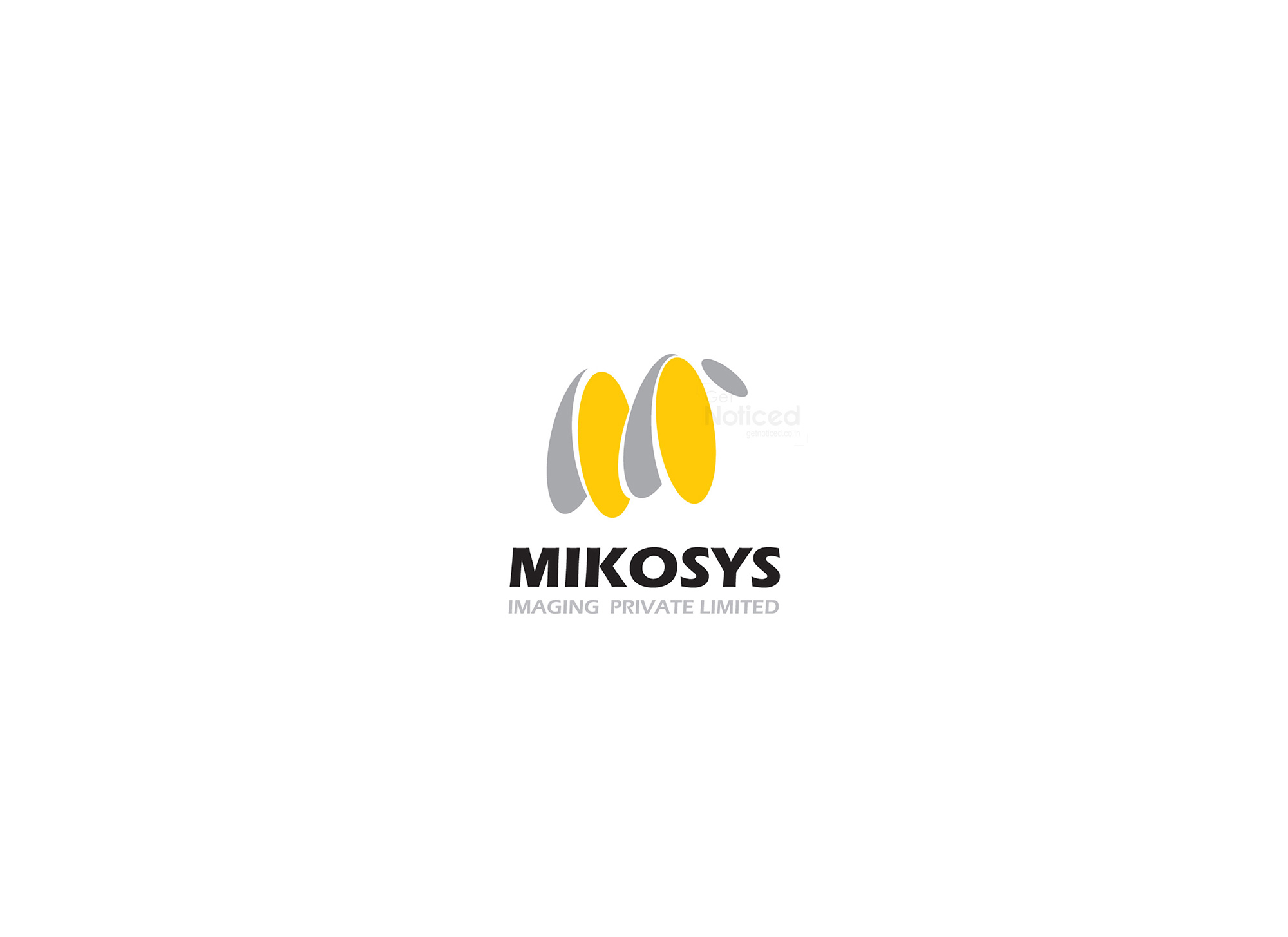
The Power of the Letter "M": After extensive brainstorming and design iterations, we found that the letter "M" held great potential for capturing Mikosys' identity. To add a touch of creativity and playfulness, we decided to implement a cartoon-like effect in the letter. This approach not only symbolized the brand's focus on outdoor advertising but also added a sense of approachability and friendliness.
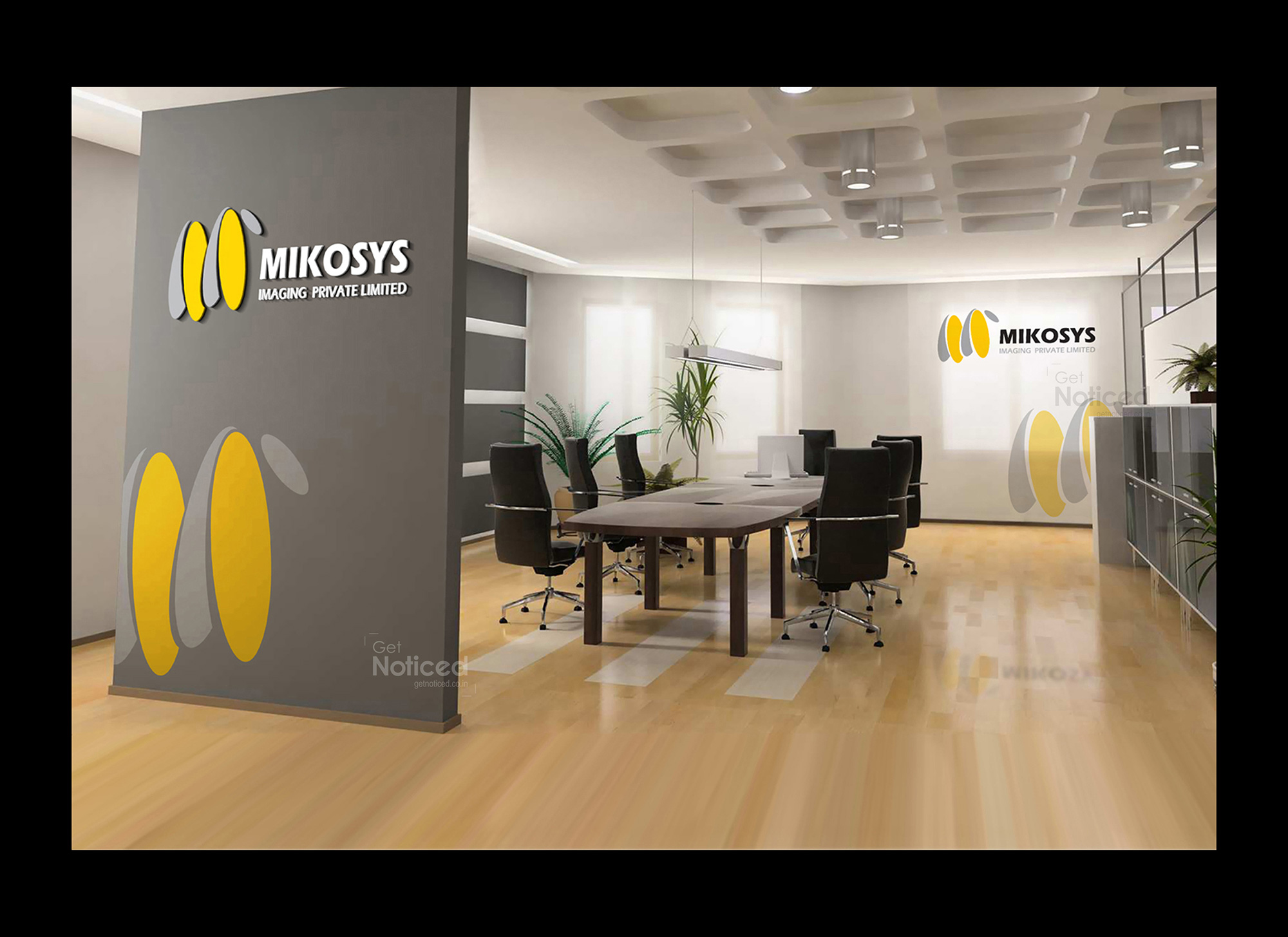
The Final Logo: Out of the four sample logos we presented, the chosen design stood out as the clear winner. The final logo expertly combined the unique characteristics of the letter "M" with a playful cartoon effect. The vibrant colors and clean lines emphasized Mikosys' commitment to providing high-quality products and services, while the overall design exuded a sense of professionalism and creativity.
A Logo that Speaks Volumes: The crafted MIKOSYS logo successfully captured the essence of the brand and its core values. The letter "M," transformed into a cartoon-like symbol, became a memorable representation of Mikosys' dedication to outdoor advertising. The logo effortlessly communicated the company's commitment to high-quality printing, while the playful design added an element of visual appeal and approachability.
Conclusion: Through collaboration, inspiration, and attention to detail, our creative designing team successfully crafted a logo that captured the essence of Mikosys. The letter "M" with its cartoon effects effectively conveyed the brand's focus on outdoor advertising, while the overall design showcased professionalism and creativity. We take pride in our work and are confident that the MIKOSYS logo will elevate the brand's visibility and leave a lasting impression on its target audience.