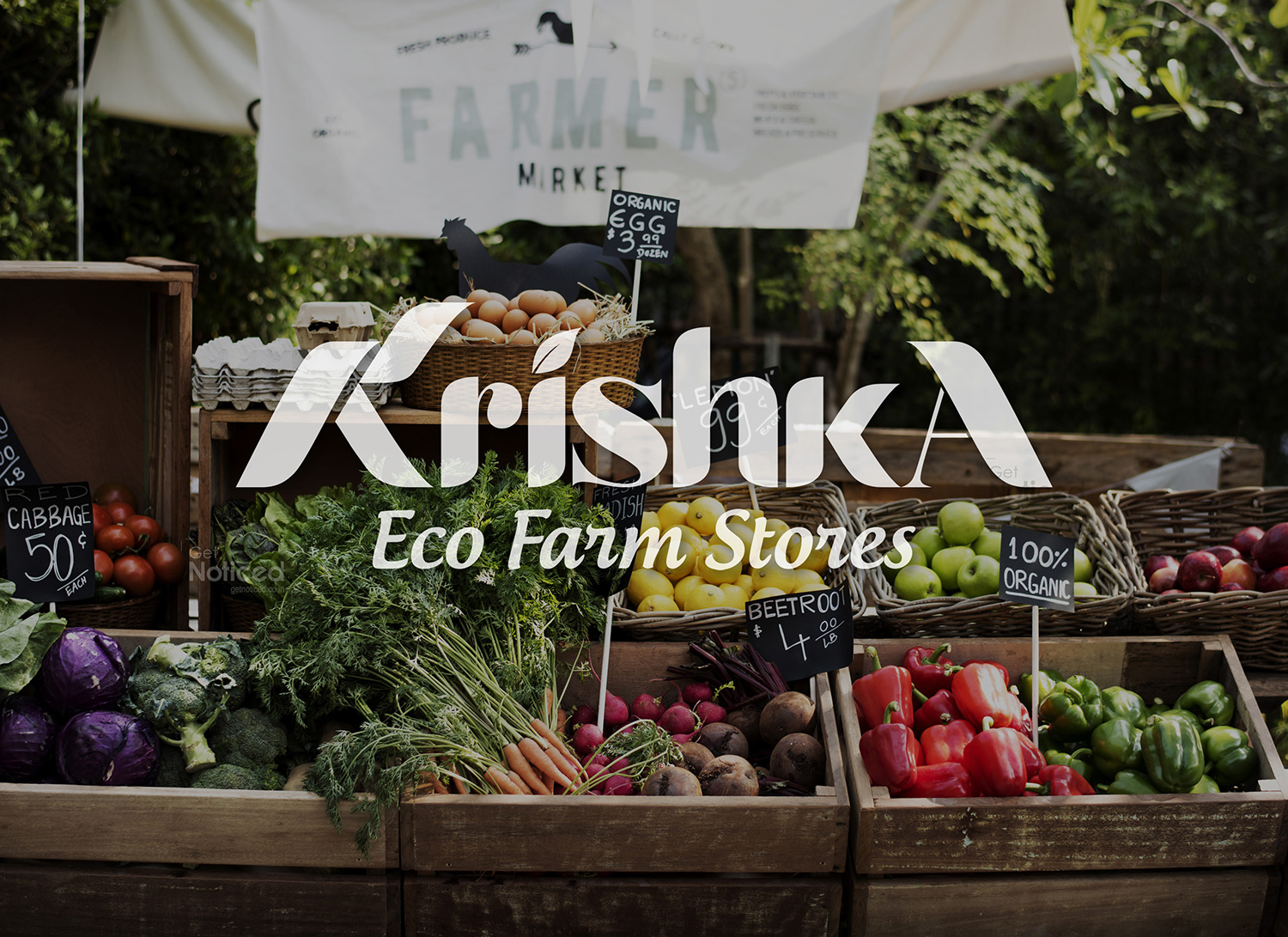
Krishka Logo Design
Handled: Logo Design, Nature & Organic
Client Name: Krishka Eco Farm Store
Industry: Eco Store
City: Chennai
Country: India
Other designs handled for Krishka Eco Farm Store
"KRISHKA: A Logo Design Reflecting Organic Quality and Direct Farm-to-Consumer Approach" designed by our get noticed logo design team
Introduction: In an era where consumers are increasingly conscious about their health and the environment, the demand for organic products has seen a significant rise. To cater to this growing trend, Get Noticed, a renowned branding agency, has developed a captivating logo design for the new brand "KRISHKA" - a unique Eco Farm Store dedicated to delivering high-quality, hygienic, and completely organic products. The logo encapsulates the brand's commitment to connecting farmers directly with consumers, promoting health, and preserving the environment.
Symbolism and Meaning: The KRISHKA logo incorporates the first letter "K" and the last letter "A" of the brand name, forming a visually engaging and memorable mark. This clever design choice represents the brand's distinctive approach, highlighting its direct connection between farmers and consumers. By excluding any intermediaries or mercantile agents, KRISHKA ensures that its customers receive top-notch organic items directly from the source.
Color Palette: The logo utilizes a combination of green and blue colors to convey its core values and message effectively. The dominant green hue represents the brand's focus on eco-friendly practices and its commitment to sustainability. Green is commonly associated with nature, growth, and freshness, emphasizing the organic nature of KRISHKA's products. Additionally, green signifies health and well-being, aligning perfectly with the brand's objective of delivering high-quality organic goods.
The complementary blue color within the logo signifies serenity, stability, inspiration, and wisdom. It evokes a sense of trust and reliability, assuring consumers of the brand's commitment to providing the best possible products. Blue also represents the purity and cleanliness of KRISHKA's offerings, further enhancing its appeal to health-conscious individuals seeking unadulterated organic food items.
Overall Impression: The KRISHKA logo design effectively communicates the brand's ethos and unique selling proposition. Its clean and minimalist approach ensures that the message is clear and easily recognizable. The combination of green and blue colors not only creates an aesthetically pleasing visual identity but also conveys the brand's focus on eco-friendliness, quality, and customer satisfaction.
By showcasing the direct farm-to-consumer connection through the strategic placement of the letters "K" and "A," the logo establishes a strong bond of trust and transparency. It assures customers that KRISHKA is committed to providing them with the freshest organic produce, including spices, fresh cow milk straight from the diary, and various other organic food items.
Conclusion: The logo designed by Get Noticed for KRISHKA Eco Farm Store encapsulates the brand's vision, values, and commitment to delivering high-quality organic products directly from farmers to consumers. The green and blue color combination evokes a sense of eco-friendliness, purity, and reliability, making it appealing to health-conscious individuals seeking organic options. With this visually engaging and symbolic logo, KRISHKA is well-positioned to get noticed and establish itself as a trusted and preferred provider of organic goods, promoting the idea that "health is wealth."