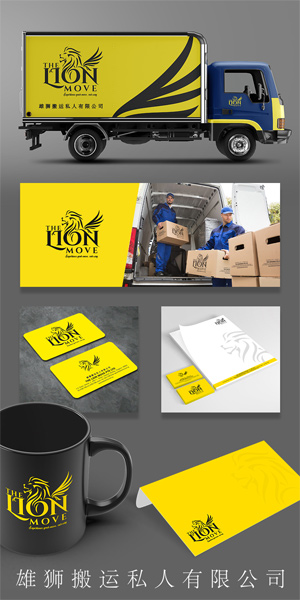
One Lion Movers Logo Design
Handled: Logo Design, Tours & Travels
Client Name: One Lion Movers
Industry: Logistics
City: Singapore
Country: Singapore
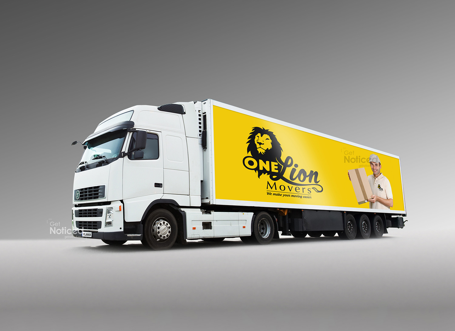
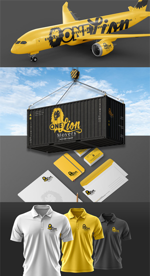
Other designs handled for One Lion Movers
Crafting the Logo for ONE LION MOVERS: A Perfect Blend of Creativity and Client Expectations delivered by our logo designing team get noticed
Introduction: Creating a captivating logo that effectively represents a brand's identity is crucial for establishing a strong presence in the market. When our esteemed client, a well-established logistics company in Singapore, approached our creative design team to craft a logo for their new venture, ONE LION MOVERS, we understood the importance of delivering a design that aligned with their vision and expectations. With over 12 years of collaboration, our team possessed a deep understanding of our client's preferences and embarked on the journey to create a logo that would embody their new packers and movers service while incorporating their requested lion motif.
Understanding Client Expectations: Given our longstanding relationship with the client, we were well-aware of their expectations for this project. Our team recognized the significance of incorporating the lion element into the logo design, as it held symbolic value to our client and represented strength, reliability, and dominance. In addition to the lion, our client emphasized the importance of conveying the message of safe and high-quality packing and moving services provided by ONE LION MOVERS.
The Creative Process: Armed with the client's briefing and requirements, our design team began brainstorming and exploring various concepts that would effectively capture the essence of the brand. After careful consideration, we decided to adopt the mascot logo type, using a stylized lion face as the central element of the design.
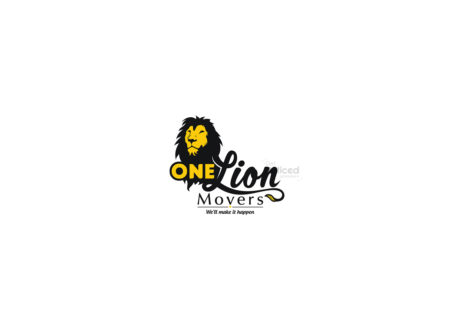
The Logo Design: The finalized logo for ONE LION MOVERS seamlessly blended the lion motif with the brand name, delivering a visually appealing and powerful representation. The lion's face, with its majestic and confident expression, exuded trust and reliability. The use of bold and clean lines added a modern touch, emphasizing the company's commitment to efficient and professional moving services.
Incorporating the tail of the lion within the typography of the brand name further reinforced the company's comprehensive approach to packing and moving, indicating that every aspect of the process would be handled with meticulous care and attention to detail. The tail symbolized the completion and assurance of a seamless experience, offering customers the peace of mind they seek when entrusting their belongings to ONE LION MOVERS.
Client Satisfaction: Upon presenting the logo design to our client, we received a resounding positive response. The logo not only met their expectations but also exceeded them by encapsulating the core values of the brand. The client acknowledged the thoughtfulness put into the design, the clear representation of the lion motif, and the seamless integration of the brand name with the lion's tail.
Conclusion: Crafting a logo that satisfies a client's expectations is a challenging endeavour, but our creative design team successfully met the demands of our esteemed client, who sought a logo that incorporated the lion motif and communicated the company's commitment to safe and high-quality packing and moving services. By skilfully blending creativity and client understanding, we created a logo for ONE LION MOVERS that not only captures attention but also establishes a strong brand identity within the competitive logistics industry in Singapore.