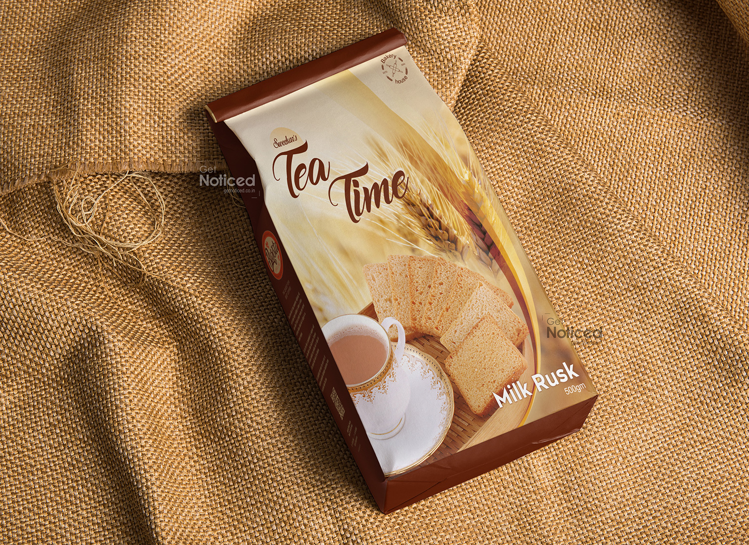
Tea Time Packaging Design
Handled: Packaging Design, Food & Desserts
Client Name: Tea Time
Industry: Milk Rusk
City: Chennai
Country: India
Get Noticed Team Delivers Inspiring Packaging Design for TEA TIME Milk Rusk Product
Introduction In a market filled with numerous brands vying for consumer attention, packaging design plays a pivotal role in capturing potential customers' interest. The Get Noticed Team recently took on the challenge of designing the packaging for TEA TIME's milk rusk product. Combining creative design elements with professional photography, their aim was to create a visually striking package that would stand out on supermarket shelves alongside leading competitors. This article explores how the Get Noticed Team successfully met this challenge, resulting in increased sales and client appreciation for their inspiring design.
Designing the Packaging The packaging design process for TEA TIME's milk rusk product involved the Get Noticed Team's collaborative efforts, aiming to create a design that would leave a lasting impression on customers. The team carefully analyzed the brand's values, target audience, and market competition to develop a design that would differentiate TEA TIME from its competitors while staying true to its identity.
Challenging Competitors with a Unique Design As a new entrant in the market, TEA TIME faced the daunting task of competing with established brands. The Get Noticed Team understood this challenge and strived to create a packaging design that would captivate customers and leave a lasting impression.
Inspiring Design Elements To achieve their goal, the creative team incorporated a blend of unique and inspiring design elements into the packaging. These elements aimed to convey the premium quality and deliciousness of TEA TIME's milk rusk product. Through extensive brainstorming sessions, the team explored various color schemes, typography, and imagery options to create an eye-catching design that would resonate with the target audience.
Professional Photography for Added Appeal Understanding the importance of visual appeal in packaging design, the Get Noticed Team incorporated professional product photography into TEA TIME's milk rusk packaging. They collaborated with skilled photographers who expertly captured the product in its most appetizing form. The result was stunning visuals that immediately grabbed attention and enticed customers to pick up the package from the supermarket shelf.
Multicolor Offset Printing To ensure the design translated seamlessly onto the packaging material, the Get Noticed Team provided expertise in multicolor offset printing. They advised TEA TIME on selecting the most suitable printing techniques to achieve vibrant colors and crisp imagery. The team's attention to detail and commitment to quality allowed them to optimize the printing process, resulting in visually striking packaging that exuded professionalism and sophistication.
Increased Sales and Client Appreciation TEA TIME's decision to collaborate with the Get Noticed Team on their packaging design proved to be a success. With the new packaging design in place, TEA TIME witnessed a noticeable increase in sales. Customers were drawn to the visually appealing packaging, which stood out amongst competitors on supermarket racks.
The client expressed their appreciation for the Get Noticed Team's efforts, acknowledging the team's ability to create a design that effectively showcased TEA TIME's milk rusk product. Through their collaborative approach and dedication to delivering an inspiring design, the Get Noticed Team played a significant role in helping TEA TIME establish a strong presence in the market.
Conclusion The Get Noticed Team's creative packaging design, complemented by professional photography and multicolor offset printing, allowed TEA TIME's milk rusk product to make a memorable impression on customers. The team's innovative approach successfully tackled the challenge of competing against leading brands in the market. As a result, TEA TIME experienced increased sales and earned client appreciation for their inspiring and visually striking packaging design.


