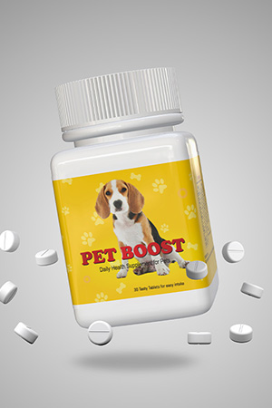
Sky Ec Packaging Design
Handled: Packaging Design, Pet
Client Name: Sky Ec
Industry: Pet Health Care Products
City: Chennai
Country: India
Other designs handled for Sky Ec
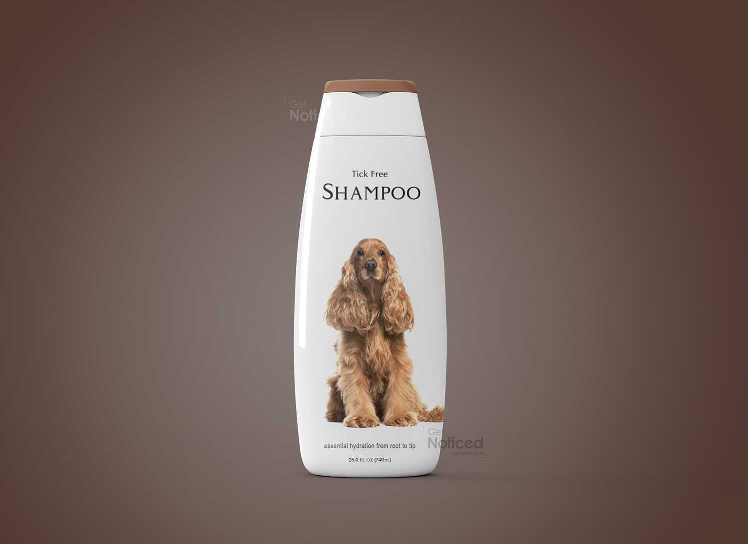
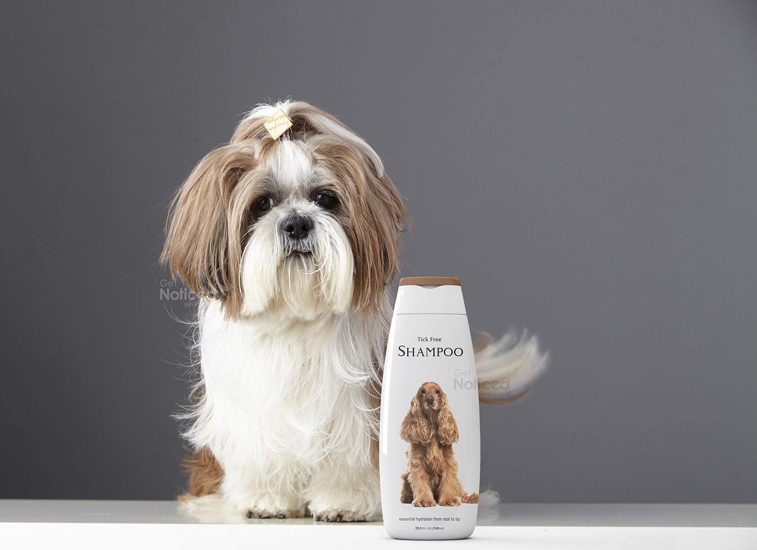
Shielding Pets, Elevating Style: Get Noticed Redefines Tick Free Pet Shine Shrink Wrapper Design
In the dynamic world of pet care, Tick Free Pet Shine stands out as a guardian against pests, and at the forefront of this visual representation is the creative brilliance of the Get Noticed team. Tasked with the design of the shrink wrapper for Tick Free Pet Shine, the team seamlessly blended protective functionality with elevated aesthetics, resulting in packaging that not only shields the product within but also stands as a visual testament to the brand's commitment to pet well-being.
Unveiling the Shield of Protection The journey began with the Get Noticed team immersing themselves in the unique needs of pet owners and their furry companions. Recognizing that Tick Free Pet Shine isn't just a grooming essential but a protective shield against ticks and pests, the team set out to design a shrink wrapper that resonates with the brand's dedication to pet health and safety.
Key Features of the Shrink Wrapper Design: Striking Tick and Pest Imagery: The shrink wrapper design incorporates compelling imagery of ticks and pests crossed out, symbolizing the effectiveness of Tick Free Pet Shine. This visual representation not only communicates the product's primary function but also assures pet owners of its protective qualities.
Bold Color Palette: A bold and attention-grabbing color palette dominates the design, reflecting the strength and efficacy associated with tick prevention. The choice of colors ensures that the packaging communicates a sense of reliability and urgency, aligning with the protective nature of the product.
Clear and Informative Typography: Essential details about Tick Free Pet Shine, including its tick-repelling ingredients and application instructions, are presented in clear and legible typography. The font style strikes a balance between modernity and a sense of authority, reinforcing the product's protective qualities.
Brand Consistency: The Tick Free Pet Shine logo is prominently displayed, contributing to brand consistency and recognition. The logo placement, coupled with tick imagery and pet-friendly design elements, enhances the wrapper's appeal. Unveiling Protective Elegance: Tick Free Pet Shine Shrink Wrapper Design As Tick Free Pet Shine graces the shelves, the shrink wrapper becomes a visual ambassador for the protective shield that the product offers to pets. The wrapper isn't just packaging; it's a visual representation of the brand's commitment to providing pet owners with a reliable defense against ticks and pests.
The Impact Get Noticed has successfully translated the essence of Tick Free Pet Shine into a shrink wrapper design that not only protects but also communicates the product's efficacy. The packaging stands as a visual testament to Tick Free Pet Shine's dedication to safeguarding pets from the perils of ticks.
In a market saturated with pet care products, Tick Free Pet Shine, adorned with its compelling shrink wrapper design, stands out as a symbol of protection and care. Get Noticed has not merely designed a wrapper; they've crafted a visual narrative that invites pet owners to shield their furry friends in style. It's not just a product; it's a visual celebration of protective elegance, encapsulated in every detail of its thoughtfully designed shrink wrapper.