Sydha Movers logo design
Handled: Logo Design, Tours & Travels
Client Name: Sydha Movers
Industry: Logistics
City: Singapore
Country: Singapore
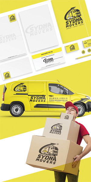
Other designs handled for Sydha Movers
the call for us form sinapore from Sydha Mover Unveils New Logo: Delivering Professionalism and Efficiency
Introduction: Sydha Mover Logistics, a leading provider of relocation services in Singapore, has unveiled a new logo design to update its brand image. The logo, carefully crafted by a team of get noticed designers, aims to visually and graphically communicate the company's professionalism and commitment to providing top-notch logistics services. With a clear vision and a focus on customer satisfaction, Sydha Mover is ready to embark on a new chapter with its refreshed logo.
Meeting Customer Needs: Sydha Mover understands the diverse requirements of its clients. From international relocations to commercial and residential moves, the company offers a comprehensive range of services. Additionally, they provide manpower and transport on contractual basis for events and projects. The company's service begins from the moment a customer calls for a survey or quotation, ensuring prompt and personalized support for all logistics needs. With their specialist staff and industry expertise, Sydha Mover excels in negotiating competitive costs while maintaining a consistently high standard of service, both locally and globally.
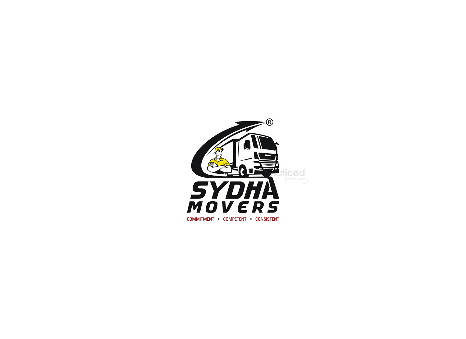
The Symbolism of the Logo: The new logo for Sydha Mover incorporates various elements that represent the core aspects of the company's operations. The design features a transport truck, symbolizing the transportation services offered by the company. This element represents the efficient and reliable movement of goods and belongings.
The inclusion of a depiction of manpower emphasizes the company's dedication to providing skilled personnel for various logistics requirements. Sydha Mover understands the importance of a competent workforce in ensuring smooth operations and customer satisfaction.
Furthermore, a right-pointing arrow, a universally recognized symbol of progress and forward movement, conveys the company's commitment to prompt and efficient deliveries. This symbol represents Sydha Mover focus on ensuring that every move is completed safely and reaches its intended destination in a timely manner.
Font and Color Considerations: The chosen font for the logo reflects a balance between professionalism and approachability. It exudes a sense of reliability and trust, aligning perfectly with the company's commitment to delivering superior services.
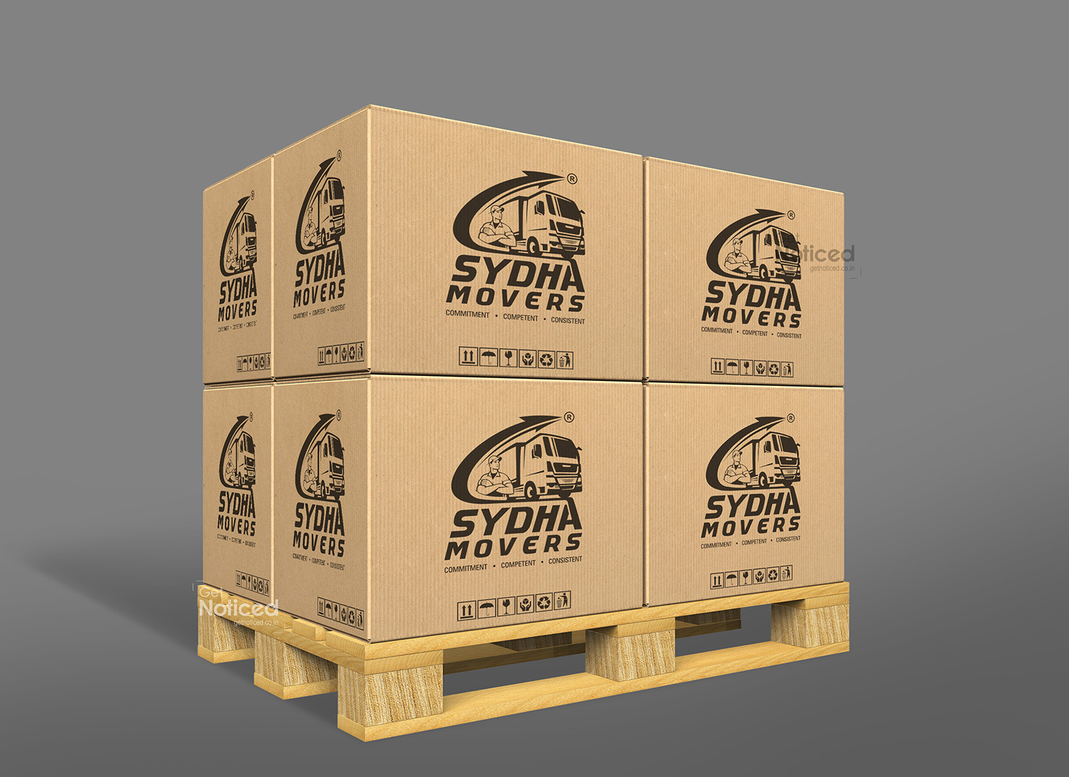
In addition to the Yellow and black color logo, a single-color version has been created for practical purposes, such as printing on packing boxes, t-shirts, and caps for delivery personnel. This adaptation ensures brand consistency and recognition across various mediums.
Conclusion: With the introduction of its new logo, Sydha Mover aims to strengthen its brand identity and reinforce its position as a professional logistics service provider. The carefully designed elements, such as the transport truck, manpower symbol, and right-pointing arrow, effectively communicate the company's dedication to prompt, safe, and reliable deliveries. Sydha Mover is ready to embark on a new phase of growth, continuing to provide top-quality logistics services to its customers, both locally and globally.