Unique Taiba Cource brochure design
Handled: Brochure Design, Education
Client Name: Unique Taiba
Industry: Engineering Academy
City: Chennai
Country: India
Other designs handled for Unique Taiba
Get Noticed Team Delivers Impressive Brochure Design for UTA - Unique Taiba Engineering Academy for Training, Placements and projects
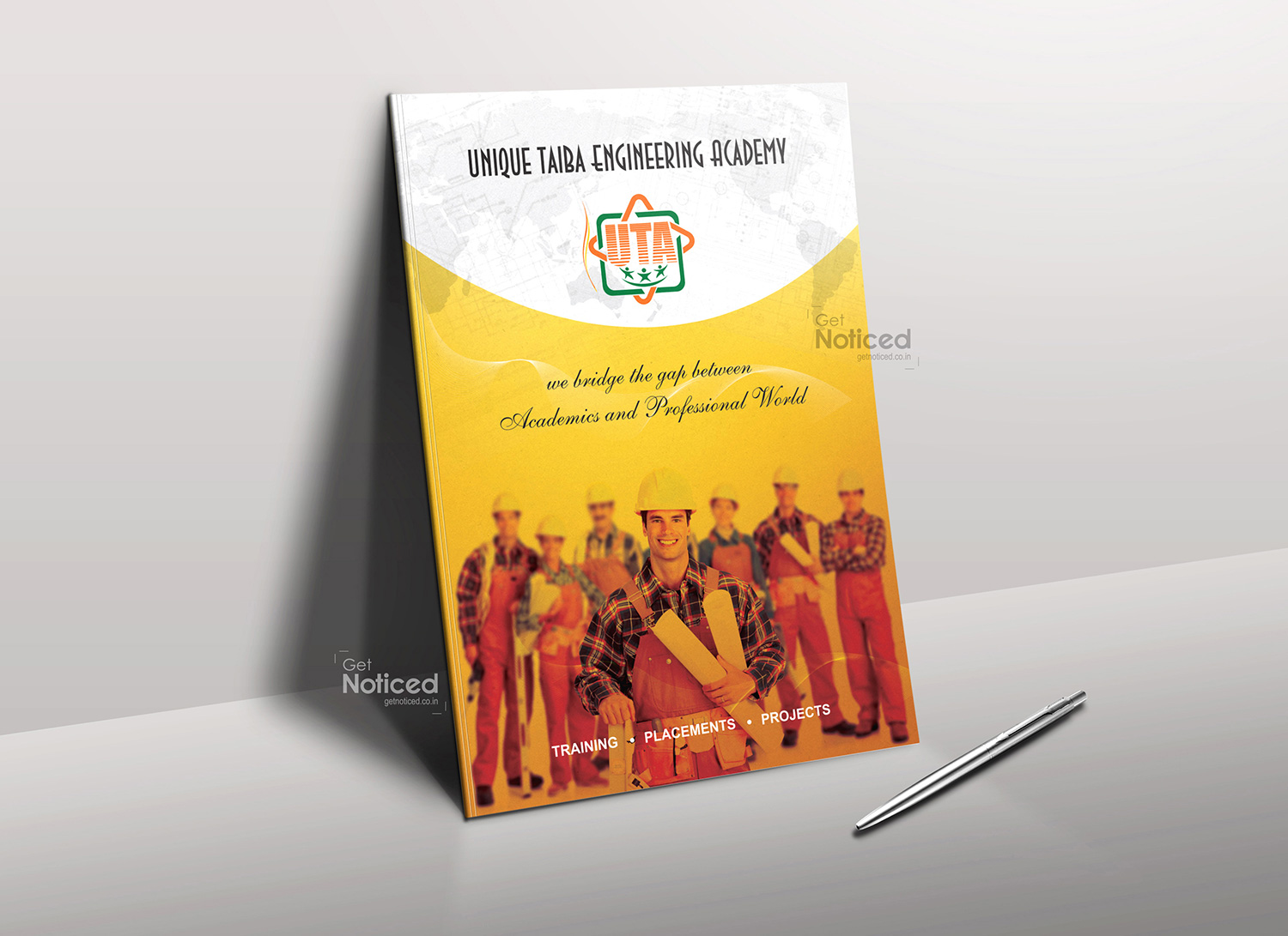
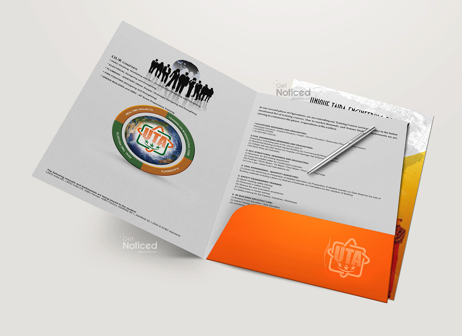
Introduction: The Get Noticed Team recently had the privilege of designing a course details folder for Unique Taiba Engineering Academy (UTA), a renowned engineering training institute based in Chennai. Following the successful design of UTA's logo, we were entrusted with the responsibility of creating an appealing brochure that would showcase the institute's diverse course offerings. We took great care in crafting a unique design that would captivate students and convey the essence of UTA's educational excellence.
Design Concept: To create an impactful design for UTA's course details folder, our team meticulously considered various elements, such as colors, fonts, and layout. We aimed to strike a balance between professionalism and creativity, ensuring that the brochure would effectively communicate the institute's commitment to quality education.
Color Selection: The choice of colors is crucial in conveying the desired message and evoking the right emotions. With UTA being an engineering academy, we wanted to create a design that reflected a sense of innovation and modernity. After careful consideration, we selected a combination of mild yellow and white for the cover page. The mild yellow exudes positivity and energy, while white represents purity and clarity. This color scheme provides a visually appealing and vibrant backdrop for UTA's course offerings.
Font Selection: To ensure that the course details were presented clearly and effectively, we opted for bold fonts. The bold typeface lends a sense of authority and grabs the reader's attention, making it easier for students to navigate through the information. The goal was to create a brochure that was not only aesthetically pleasing but also functional in conveying crucial details about UTA's courses.
Timely Delivery and Perfect Design: At Get Noticed, we understand the importance of timely delivery and ensuring a flawless final product. We worked diligently to meet UTA's expectations and delivered the course details brochure on schedule. Our team paid meticulous attention to detail, ensuring that the design was visually appealing, the content was clear and descriptive, and the overall layout was well-structured. The final result was a brochure that not only impressed UTA but also effectively showcased the institute's offerings to prospective students.
Conclusion: The collaboration between Get Noticed and Unique Taiba Engineering Academy to design their course details folder was a resounding success. We took great pride in building upon the initial design of UTA's logo and creating a visually appealing and informative brochure. By carefully selecting colors, fonts, and maintaining a keen eye for detail, we delivered a brochure that conveys UTA's commitment to providing quality engineering education in an engaging and professional manner. We look forward to future opportunities to collaborate with UTA and continue to contribute to their success in attracting aspiring engineering students.