Code & Colors Catalogue Design
Handled: Brochure Design, Product Catalogue
Client Name: Code & Colors
Industry: Uniform Fabric Manufacturers
City: Salem
Country: India
Other designs handled for Code & Colors
Code & Colors Fabric Sample Catalogue: Unveiling the Essence of Fine Fabrics
Introduction: At Get Noticed, we take pride in our ability to create impactful branding solutions. Our journey with Code & Colors began with the suggestion of their brand name and slogan with the logo design. Now, we are excited to showcase our latest creation: the fabric sample catalogue for Code & Colors. This catalogue serves as a tangible representation of the brand's commitment to providing high-quality fabrics for perfect uniforms.
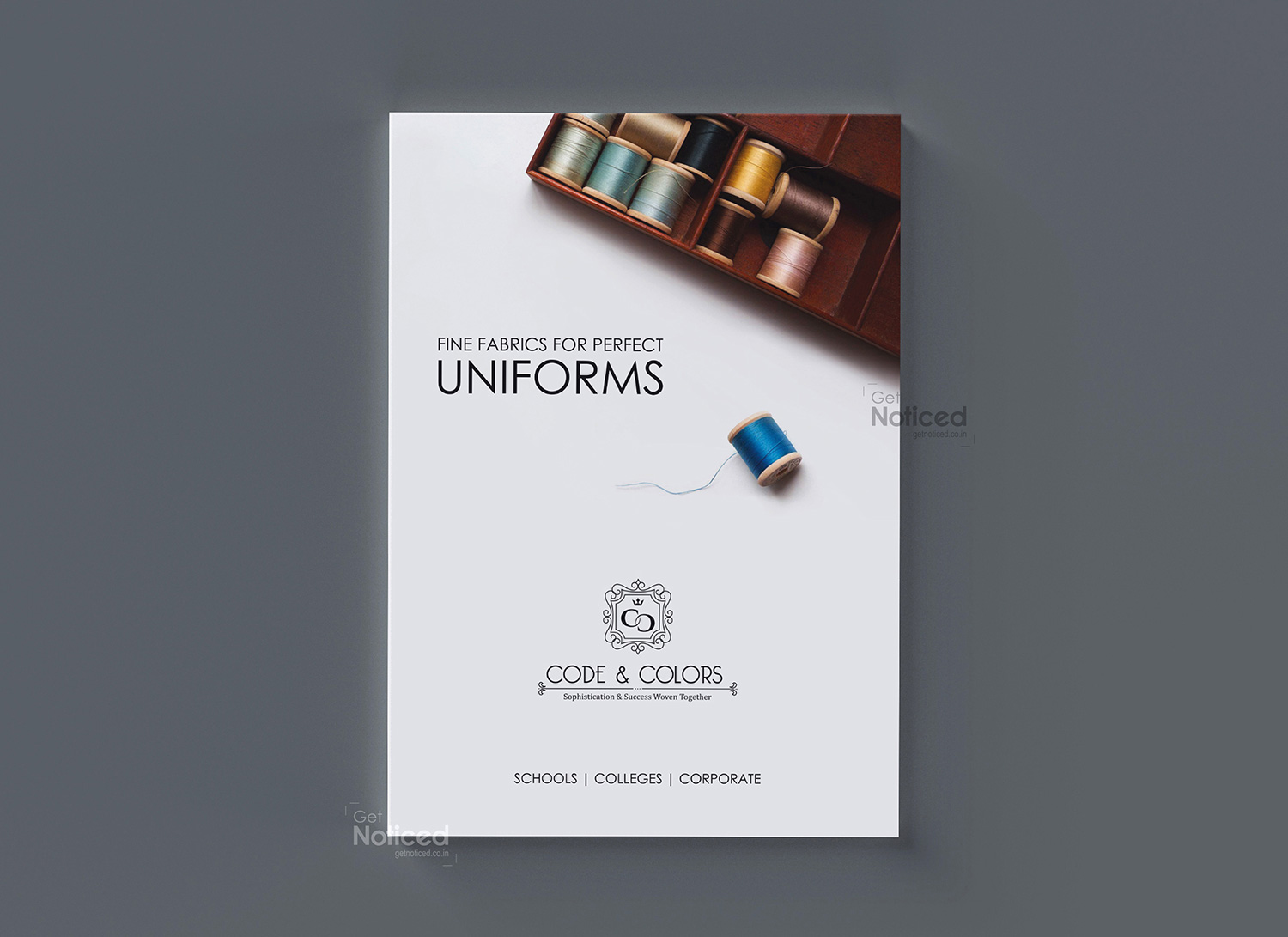
Designing the Catalogue: The A4-size, 6-page tri-fold catalogue was meticulously designed to capture the essence of Code & Colors' fabrics. The front page features an eye-catching image of Bobbins Sewing Thread Kits, which perfectly complements the catalogue's caption: "FINE FABRICS FOR PERFECT UNIFORMS." The brand logo is strategically placed to reinforce brand recognition.
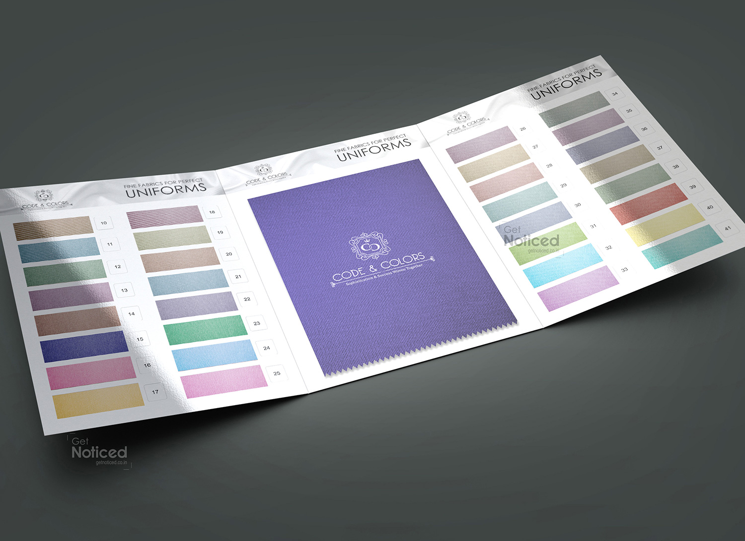
Immersive Fabric Experience: To provide customers with an immersive experience, we dedicated three pages of the catalogue to showcasing real fabric samples. Different varieties of fabric are carefully pasted onto the pages, allowing customers to touch and feel the quality firsthand. Each fabric is accompanied by its unique code, making it easier for customers to reference and order their desired fabrics.
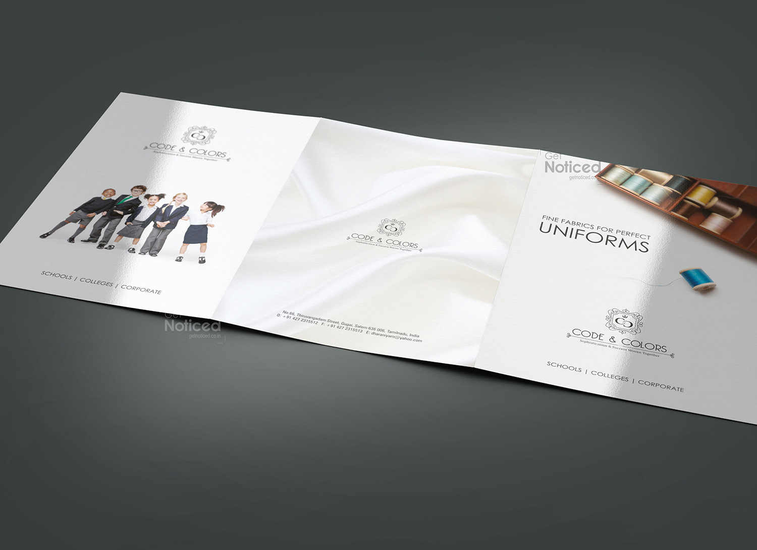
Visual Appeal: In addition to the fabric samples, two pages of the catalogue feature a group of school children dressed in different uniforms. This visually appealing display not only showcases the versatility of Code & Colors' fabrics but also evokes a sense of connection and reliability for customers. The inclusion of diverse uniforms reinforces the brand's ability to cater to a wide range of uniform requirements.
Contact Details and Expert Print Execution: The last page of the brochure is dedicated to displaying the contact details of Code & Colors, ensuring that interested customers can easily reach out for inquiries and orders. However, the real challenge lay in the print execution of the tri-fold catalogue. Our experienced print experts played a vital role in ensuring that the fabric samples were accurately pasted, with precise space measurements allocated for each sample. This attention to detail guarantees a flawless and visually appealing final product.
Conclusion: The Code & Colors fabric sample catalogue, designed by Get Noticed, truly showcases the brand's dedication to providing fine fabrics for perfect uniforms. With its captivating design and immersive fabric experience, the catalogue allows customers to engage with the products on a tactile level. The inclusion of real fabric samples, along with their corresponding codes, simplifies the ordering process for customers. Furthermore, the visually appealing display of school children in different uniforms adds a touch of reliability and diversity. With the expertise of our print team, the tri-fold catalogue successfully brings together aesthetics and functionality. At Get Noticed, we are thrilled to have played a part in Code & Colors' brand journey, and we look forward to further collaborations in the future.