Code & Colors Logo Design
Handled: Logo Design, Fashion & Beauty
Client Name: Code & Colors
Industry: Uniform Fabric Manufacturers
City: Salem
Country: India
Other designs handled for Code & Colors
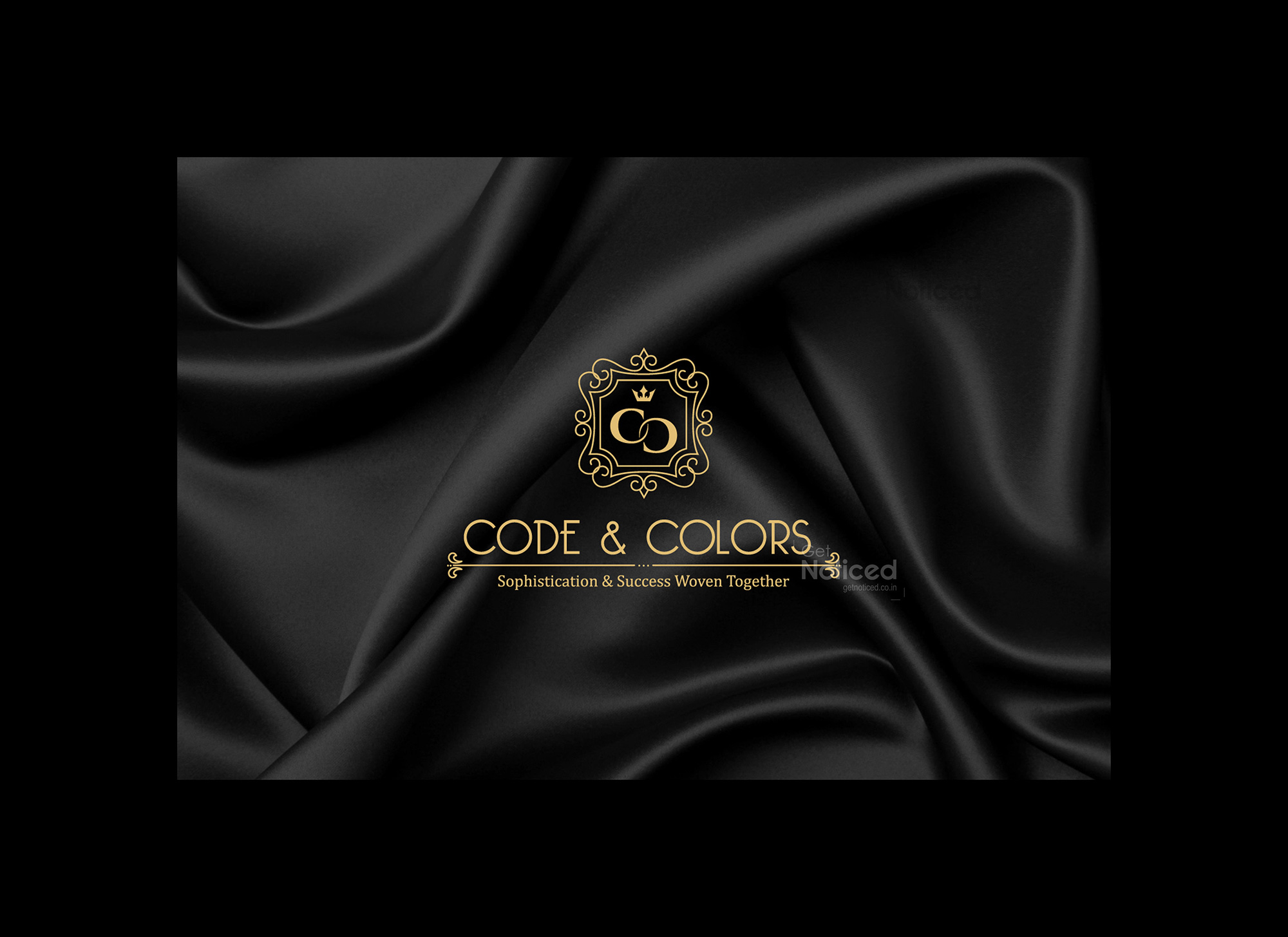
Crafting the Logo for CODE & COLORS by our logo design team : A Perfect Match of Sophistication & Success
Introduction: A great logo is a powerful tool for any business, as it represents the essence of the brand and captures its values and identity. The creative designing team at get noticed recently had the opportunity to showcase their skills when they were approached by a client in the fabric manufacturing industry. The client's objective was to establish their brand, "Uniform Fabric Manufacturers," catering to various sectors including schools, colleges, corporate, IT companies, and hospitals. The chosen brand name, CODE & COLORS, along with the slogan "Sophistication & Success Woven Together," perfectly aligned with the client's vision. Let's delve into the journey of designing their logo and the ideas behind it.
Matching the Brand's Essence: After proposing several name options to the client, CODE & COLORS emerged as the frontrunner. This name captured the nature of the business, highlighting the importance of fabric colors while incorporating the concept of codes, denoting precision and professionalism. The client resonated with the name's ability to communicate their responsibility as uniform fabric manufacturers effectively.
The Concept: With a clear direction in mind, our creative designing team embarked on the journey of crafting a logo that would encompass the essence of CODE & COLORS. Their vision was to create a combination mark logo that integrated both the brand name and a symbol, exuding a classic and regal appeal.
The Royal Touch: The team decided to infuse the logo with a touch of royalty, symbolizing the elegance and sophistication associated with CODE & COLORS. By employing a royal-style font, the brand name became a prominent feature of the logo, drawing attention and conveying a sense of quality. The typography was carefully chosen to strike a balance between readability and a regal aesthetic.
Symbolic Representation: Alongside the brand name, a symbolic element was incorporated to enhance the visual impact and leave a lasting impression. This symbol was meticulously designed, taking inspiration from the fabrics and patterns manufactured by CODE & COLORS. The symbol represents the unity of different colors and patterns woven together seamlessly, symbolizing the brand's commitment to producing diverse and high-quality uniform fabrics.
Presentation and Delivery: After countless iterations and creative exploration, our team presented the final logo design to the client. The presentation showcased the combination mark logo, featuring the distinctive royal-style typography of the brand name alongside the symbolic element representing unity in colors and patterns. The design encapsulated the sophistication and success that CODE & COLORS aimed to achieve as a prominent player in the uniform fabric manufacturing industry.
iterations Conclusion: The creative designing team at get noticed successfully crafted a remarkable logo for CODE & COLORS, aligning with the client's vision of sophistication and success. The combination mark logo, with its royal-style typography and symbolic representation, effectively communicates the brand's identity and its commitment to producing high-quality uniform fabrics. This logo will undoubtedly serve as a visual ambassador for CODE & COLORS, helping them make a lasting impression in the market and establish their brand as a reliable and premium choice for uniform fabric manufacturers.


