Fortius Fud Packaging Design
Handled: Packaging Design, Health Care
Client Name: Fortis
Industry: protein powder
City: Chennai
Country: india
Other designs handled for Fortis
Get Noticed Team Crafts Eye-Catching Package Design for Foutius Fud Nutrition Supplements Powder
Introduction: In today's competitive market, product packaging plays a crucial role in attracting consumers' attention and communicating the brand's essence. The packaging design serves as a silent ambassador, representing the quality and value of the product it contains. One notable example of outstanding package design is the work done by the Get Noticed team for Foutius Fud nutrition supplements powder. With their creativity and expertise, the Get Noticed team has crafted an exceptional package design that not only catches the eye but also effectively communicates the benefits of the product.
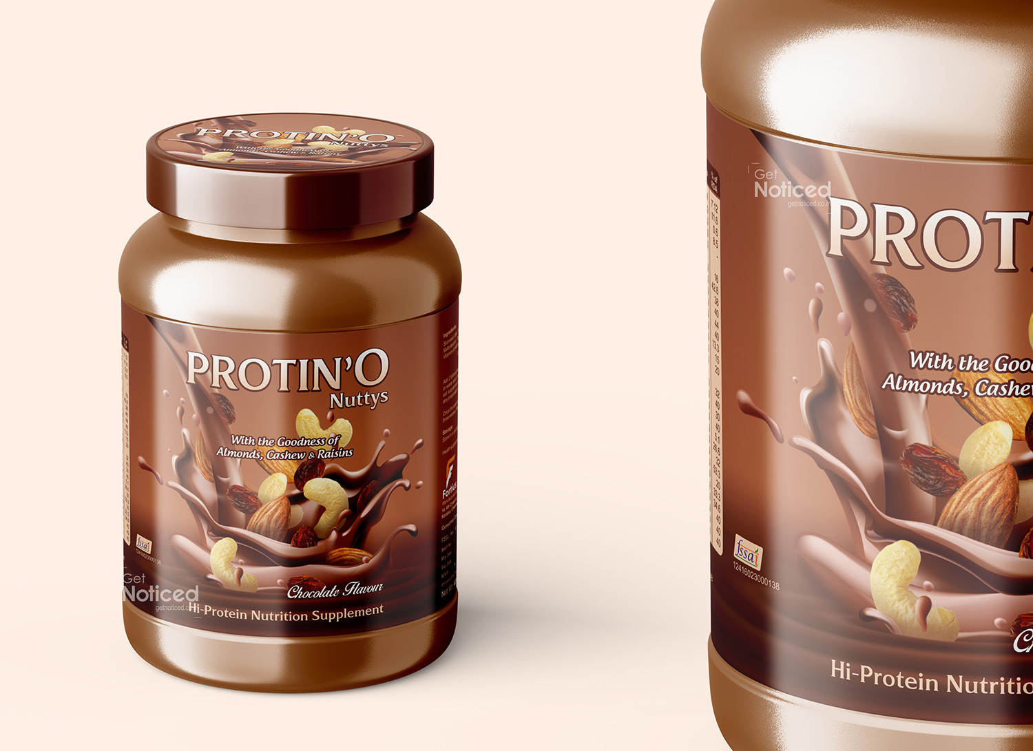
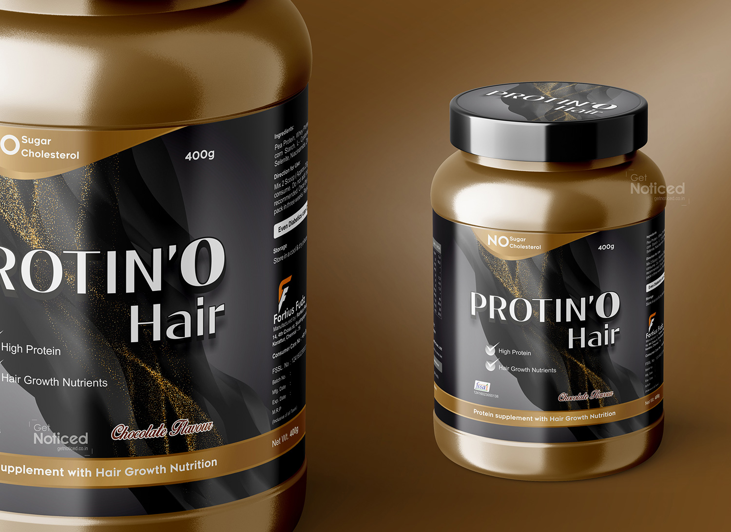
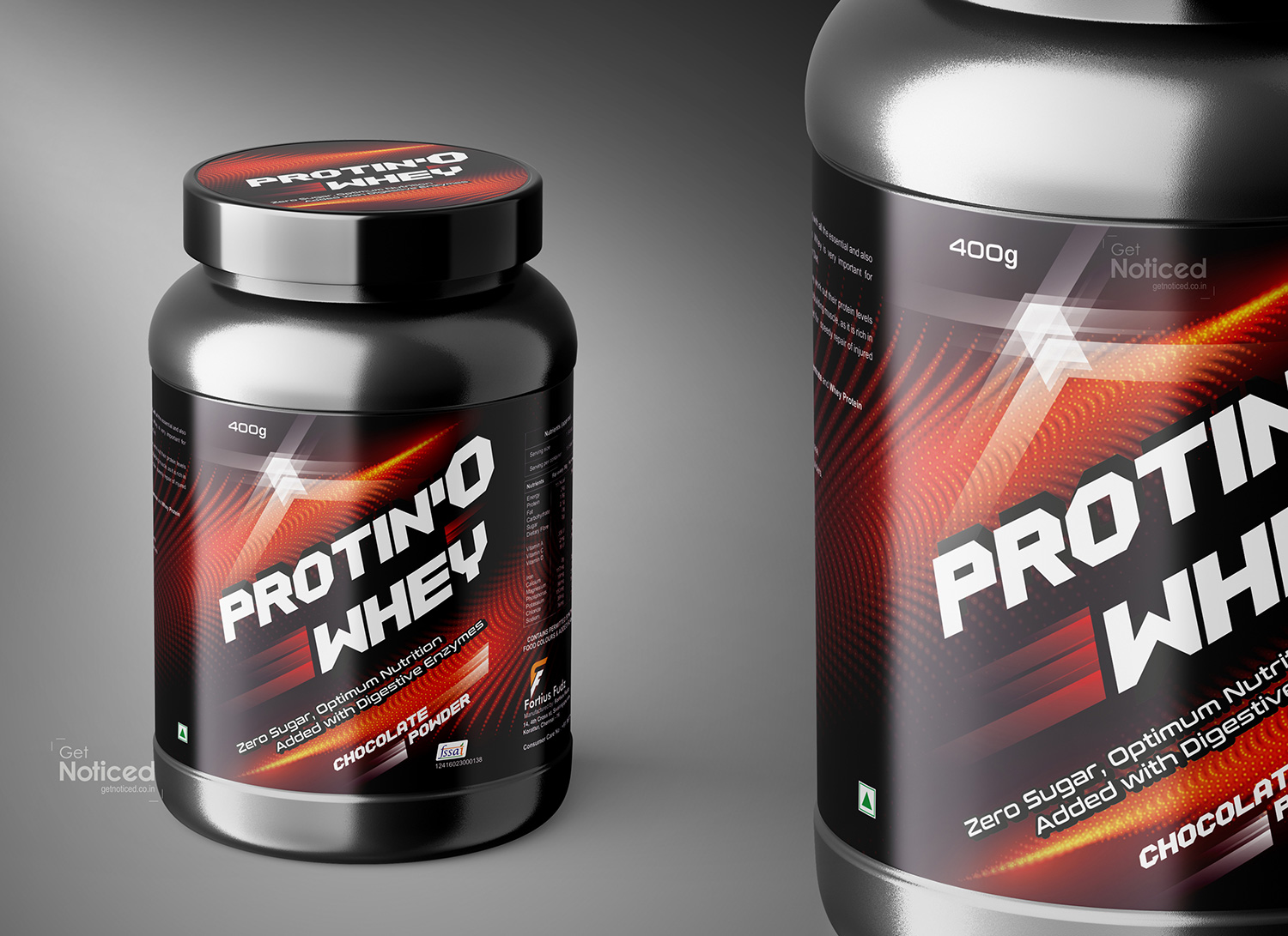
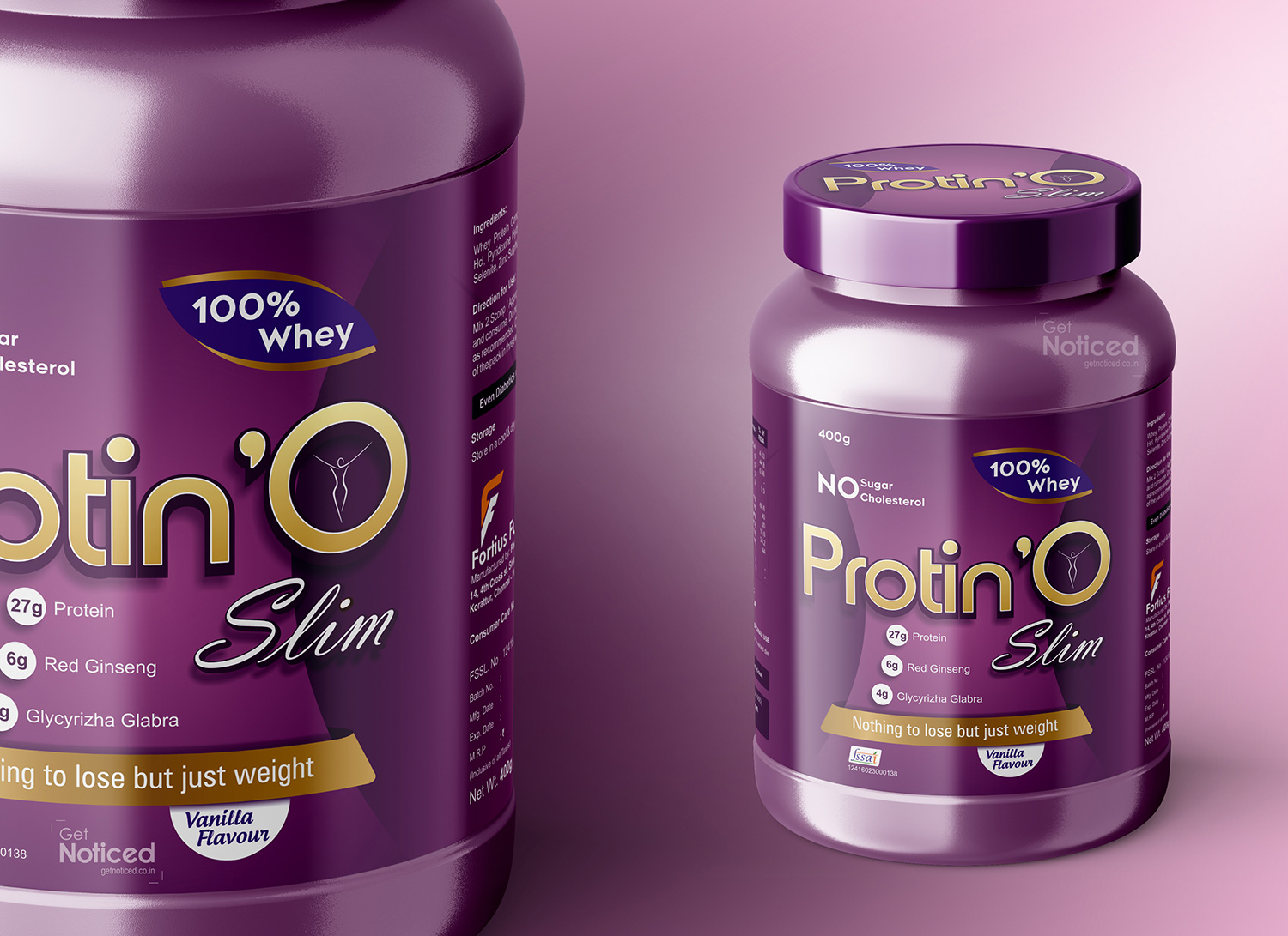
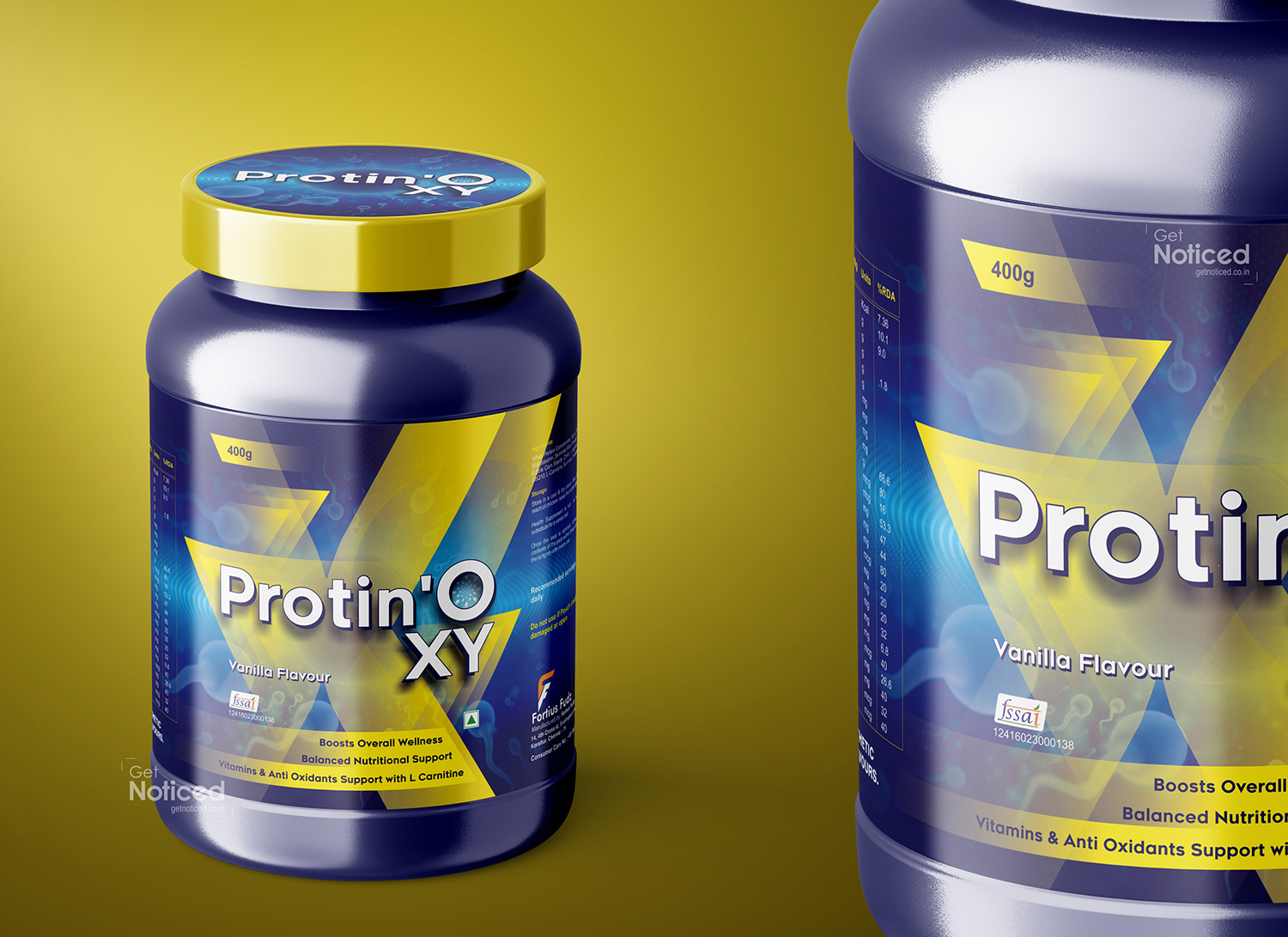
Eye-Catching Design Elements: The package design created by the Get Noticed team for Foutius Fud is a true testament to their ability to capture attention. The team opted for a sleek and modern design that aligns with the brand's ethos of providing high-quality, innovative nutrition supplements. The use of vibrant colors, bold typography, and enticing graphics immediately grabs the attention of potential customers.
The central focus of the package design is a striking image that showcases the product's key ingredients and benefits. By prominently featuring the nutrition supplements in action, the Get Noticed team successfully conveys the product's efficacy and appeal to potential buyers. The design strikes a perfect balance between showcasing the product itself and providing vital information about its usage and benefits.
Information and Clarity: While the package design catches the eye, it is also crucial for it to deliver the necessary information effectively. The Get Noticed team recognizes this importance and has expertly incorporated clear and concise information on the packaging. They have employed a thoughtful hierarchy of text, ensuring that key details such as nutritional information, product benefits, and instructions for use are prominently displayed and easily accessible to the consumer.
Additionally, the team has utilized icons and symbols to visually represent the product's features, making it easier for customers to grasp important information at a glance. By striking this balance between visual appeal and informational clarity, the package design enhances the overall user experience, creating a positive impression and building trust in the brand.
Reflecting the Brand Identity: An exceptional package design not only catches attention but also reflects the essence of the brand it represents. In the case of Foutius Fud, the Get Noticed team has successfully captured the brand's identity through their design choices. The use of bold, energetic colors and dynamic graphics conveys a sense of vitality and wellness, aligning with Foutius Fud's mission to provide customers with nutrition supplements that support an active lifestyle.
Furthermore, the choice of sustainable and eco-friendly packaging materials showcases Foutius Fud's commitment to both the health of its customers and the planet. By incorporating the brand's core values into the package design, the Get Noticed team has ensured a cohesive and memorable brand experience for consumers.
Conclusion: In the competitive world of nutrition supplements, standing out on the shelves is paramount. The Get Noticed team has risen to the challenge and delivered an exceptional package design for Foutius Fud nutrition supplements powder. Through their creative use of colors, graphics, and clear information hierarchy, they have crafted an eye-catching design that effectively communicates the product's benefits and reflects the brand's identity. With their expertise, the Get Noticed team has undoubtedly played a significant role in helping Foutius Fud make a lasting impression on potential customers and thrive in the market.