Unique Taiba Logo Design
Handled: Logo Design, Education & Training
Client Name: Unique Taiba
Industry: Engineering Academy
City: Chennai
Country: India
Other designs handled for Unique Taiba
Crafting the Unique Taiba Engineering Academy Logo design by our creative team get noticed: A Fusion of Creativity and Credibility
Introduction: Designing a logo that effectively represents the essence and credibility of a brand requires a blend of creative thinking, strategic planning, and client collaboration. This article delves into the process undertaken by our talented creative designing team at Unique Taiba to craft a distinctive logo for Unique Taiba Engineering Academy.
Understanding the Client's Vision: Unique Taiba Engineering Academy, renowned for its expertise in training engineers as "Design Engineers," approached our team with a specific request: to create a logo that would not only convey their credibility but also reflect their unique identity. To initiate the project, we engaged in a comprehensive discussion with the client to comprehend their vision, values, and aspirations.
Designing Sample Logos: With a clear understanding of the client's requirements, our creative team commenced the logo design process. Taking inspiration from the academy's name, we decided to incorporate the first character of each word: "U," "T," and "A." This approach ensured that the logo remained succinct, memorable, and representative of the academy's identity.
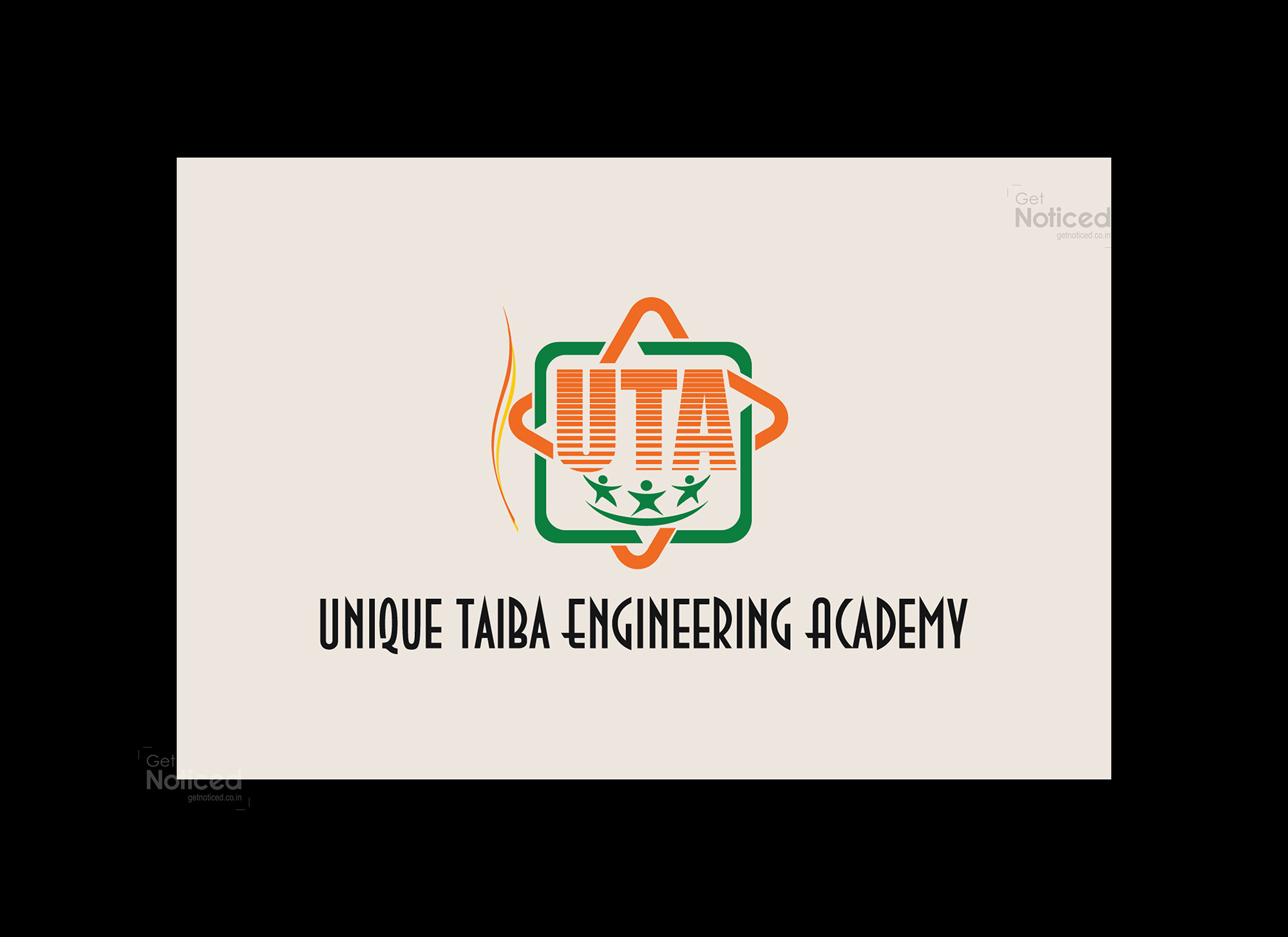
The Final Logo: After meticulous design exploration, our team crafted four sample logos, each distinct in its own right. The client actively participated in the selection process, providing invaluable feedback and insights. Eventually, the chosen logo captured the essence of Unique Taiba Engineering Academy. Here is the logo that the client approved:
Logo Description: The logo primarily features the letters "U," "T," and "A," representing Unique Taiba Academy. The decision to exclude the letter "E" was made to maintain aesthetic balance, as using all four characters would have resulted in an awkward arrangement.
To enhance visual appeal and provide a border for the logo, our team ingeniously merged square and star shapes. This combination not only adds a touch of uniqueness but also symbolizes the academy's commitment to excellence and innovation.
In terms of color selection, we opted for a vibrant palette. The use of green and orange creates a striking contrast, making the logo visually captivating and attention-grabbing. Green signifies growth, progress, and freshness, while orange represents enthusiasm, creativity, and ambition. These colors were carefully chosen to align with the academy's values and goals.
Client Satisfaction: Throughout the logo design process, our team maintained constant communication with the client, ensuring their vision and expectations were met. The client expressed satisfaction with the final logo, affirming that it effectively encapsulated the credibility and uniqueness of Unique Taiba Engineering Academy.
Conclusion: Crafting a logo that accurately reflects a brand's identity requires a collaborative effort between the designing team and the client. The logo designed for Unique Taiba Engineering Academy exemplifies this successful collaboration, as our team leveraged creative thinking, strategic planning, and client feedback to produce a visually appealing and meaningful representation of the academy's credibility and uniqueness.