Scope Logo Design
Handled: Logo Design, Fashion & Beauty
Client Name: Scope
Industry: Beauty Parlour Spa
City: Chennai
Country: India
Other designs handled for Scope
Crafting the Striking Logo for SCOPE SPA by our get noticed logo design team : A Tale of Creativity and Beauty
Introduction: A well-designed logo is essential for any business, as it serves as the visual representation and identity of the brand. When SCOPE SPA, a renowned beauty parlour and spa for women, approached our creative designing team, they were seeking a logo that would set them apart and support their business development. Through a meticulous design process and collaboration with the client, our team successfully crafted a logo that exceeded expectations, using the elegance of the peacock to convey the essence of beauty. This article provides a glimpse into the journey of creating SCOPE SPA's captivating logo.
Understanding the Design Brief: To commence the logo design process, we held an extensive questionnaire session with the client. This step aimed to gather crucial information about SCOPE SPA's values, target audience, and desired image. The client emphasized the importance of having a unique and memorable logo that would reflect the beauty and allure of their establishment.
Exploration and Presentation: Armed with a clear understanding of the design brief, our creative team embarked on the exploration phase. We sketched multiple concepts and experimented with various elements, keeping in mind the client's requirements. After meticulous brainstorming, we narrowed down our ideas to four distinct sample logos that we believed best represented the brand's identity and resonated with their target audience.
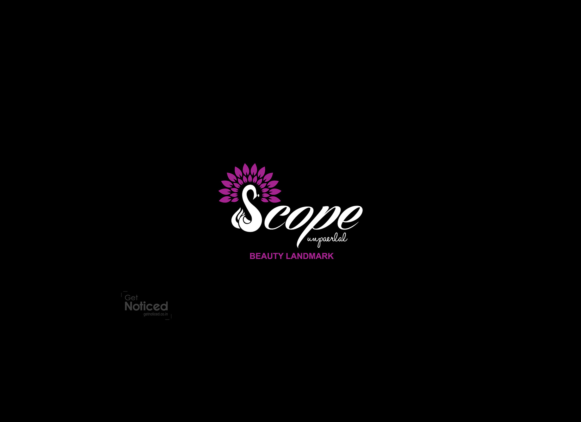
The Peacock's Radiance: Among the four sample logos presented to the client, the one that truly captivated their attention featured the graceful peacock. Recognized universally as a symbol of beauty, the peacock was the perfect choice to convey the essence of SCOPE SPA. The client agreed that it aligned perfectly with their brand image and the services they provide.
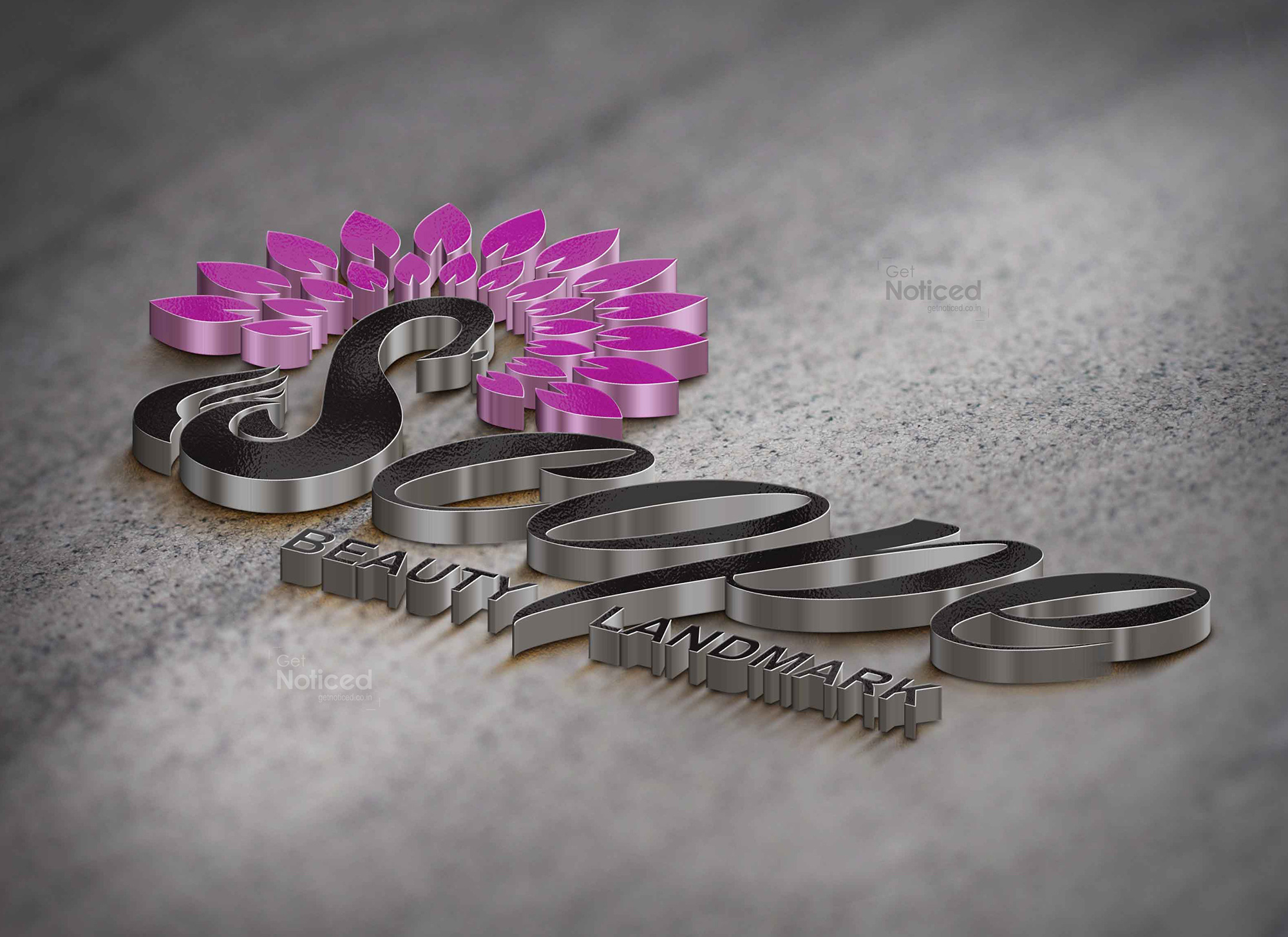
Crafting the Perfect 'S': To add a touch of uniqueness and make the logo truly outstanding, our creative team decided to incorporate the peacock in a way that represented the first letter of the shop name, 'S.' Careful attention was paid to ensure that the peacock's form seamlessly merged with the letter, creating an elegant and harmonious visual. The result was a visually stunning logo that surpassed even our initial imaginations.
Conclusion: The creation of SCOPE SPA's logo was a collaborative effort between our creative designing team and the client. Through a thorough understanding of the design brief and a keen eye for aesthetic appeal, we were able to craft a logo that successfully embodies the beauty and sophistication associated with the brand. The strategic use of the peacock symbol and its integration with the letter 'S' contributed to the logo's striking and memorable design. As SCOPE SPA continues to flourish, their logo will serve as a powerful visual representation of their commitment to providing exceptional beauty and spa services for women.